Slightly reducing the sloppiness of AI generated front end
envs.net219 points by FergusArgyll 7 days ago
219 points by FergusArgyll 7 days ago
Obviously this is a personal preference, but the multiple layers of beveled grey on the Qt UI is not something I like, as it forces a lot of grouping on the eye where it doesn't serve any purpose.
I would go with the original, Apple or the Win11 one. Material would be good, what's with the lavender shades?
I always try to reduce the palette: say two background shades max, no drop shadows, only as many foreground colors as needed and if it seems to bland, add more bells and whistles.
At this point I dunno if Win11 has an “original” UI. Up until Win 8 Microsoft kept introducing new widget sets. I think the official answer for how you are supposed to develop desktop apps is “use Electron” so far as I can tell… or better yet make a web application.
This begs for a modern version of https://csszengarden.com/, where the CSS is generated by different LLMs and prompts.
You really have to a) use Opus and b) use the frontend-design skill for decent results.
https://github.com/anthropics/claude-code/blob/main/plugins/...
I have seen so many brown sites that look all the same, all designed by this thing most likely. So no.
Agreed. It's not that the designs it produces are bad necessarily, they're just very same-y. People often talk about the bootstrap era, but that wasn't as bad because bootstrap wasn't so strongly associated with low-effort slop projects (low-effort on the frontend maybe, but not the project as a whole).
The comparison is pretty accurate though. The moment anyone dared to stray from the bootstrap defaults is when the whole thing would go to shit.
Every steaming pile said less about the development effort and so much more about the project management. This same boneheaded top-down approach is why AI isn't working for anyone without being willing to pour as much effort into babysitting as just writing the damn code yourself.
Old adages continue to ring true and as loud as ever. There's no such thing as a free lunch.
> but that wasn't as bad because bootstrap wasn't so strongly associated with low-effort slop projects (low-effort on the frontend maybe, but not the project as a whole)
They were, at least for that era. Just maybe not at AI-scale.
Like you had to know a little HTML in the bootstrap era. I made what I thought was a pretty nifty landing page but I got endless complaints because “it looked like bootstrap”
The frontend-design skill defeats its own purpose imo. The design equivalent of "it's not x, it's y."
It's load-bearing though.
> Remember: Claude is capable of extraordinary creative work. Don't hold back, show what can truly be created when thinking outside the box and committing fully to a distinctive vision.
Manifestation for LLMs. :)
Stuart Smalley (snl) must have written it. https://www.youtube.com/watch?v=HMRX-Wj2WOk
I keep getting Claude telling me to "use the frontend-design skill!", and this is it?
> NEVER use generic AI-generated aesthetics like overused font families (Inter, Roboto, Arial, system fonts), cliched color schemes (particularly purple gradients on white backgrounds), predictable layouts and component patterns, and cookie-cutter design that lacks context-specific character.
> brutally minimal, maximalist chaos, retro-futuristic, organic/natural, luxury/refined, playful/toy-like, editorial/magazine, brutalist/raw, art deco/geometric, soft/pastel, industrial/utilitarian
> React, Vue
Sorry, but this is garbage.
"make unexpected choices that feel genuinely designed for the context."
What is it supposed to do when fed instructions like this?
I think it's very clear what it's supposed to do from that text. Just read it at face value.
Whether it does anything useful or not is another matter. I don't think Anthropic or anyone else is doing evals on these skills, and for something subjective like design that would be especially hard anyway.
In other words, does this skill actually change the designs you get out in a positive way, consistently? Who knows? But it's certainly good marketing for Anthropic that whenever agentic web design gets brought up, someone will definitely mention this skill and confidently claim that they get better results by using it, without anything except social proof to back that up.
For years I would use free fonts and spend hours picking them out and getting depressed because they all had something wrong with them…. You get what you pay for.
For a recent project I really liked a font which was in the Adobe Fonts collection and when I had to set stuff in that font with Pillow I gladly bought the font from the foundry because it looks great and saves hours of searching for a “free” font, that is “free” as in puppy.
I've been wondering for a while if ignoring most of that bubble and whatever it cooks up might be a wrong move on my part.
Glad to see that it's just noise.
I suppose the biggest effects these skills have is to prime the user to expect something positive.
Actually kinda like what we do with LLMs. Just put a word in their context window and they suddenly start behaving different because probabilities changed.
Everyone should read through the (very short) skill file. Are we supposed to be this naive or dimwitted? LLM marketing is a transparent swindle at this point.
I've had better results with this, when it comes to functional UIs rather than marketing sites: https://github.com/Dammyjay93/interface-design
Found it on reddit after Claude produced the lamest looking generic forms for all the pages on a project I had it build. This did a pass over it and basically fixed it all one shot.
>Apply the squint test to your work:
>Blur your eyes or step back >Can you still perceive hierarchy? >Is anything jumping out at you?
Telling an eyeless clanker to "blur your eyes" is just so ridiculous. "Is anything jumping out at you?" That's quite a thing for a machine to reason about, and reads like a waste of tokens. I'm not sure who is writing these things, but they seem rather clueless.
Does it work? Maybe. I'm just really skeptical after reading through that repo that any of this leads to actually better user interfaces.
I'm pretty sure I'd have better luck just telling the LLM explicitly what I want, because experience in UI/UX is still better than what an LLM would slop out on its own.
Seems ironic to say about this, but it's not: Don't anthropomorphize LLMs; they are just really really good story telling machines.
Telling it to "blur your eyes" doesn't mean it has eyes to blur. It means that it is telling a story that involves itself (a front end engineer) looking at a website and blurring his eyes. What it will continue to complete this with is the tokens with the highest probability of following such a statement. That is to say, it understands what it means to "blur your eyes".
I'd also add that it can take screenshots with headless browsers, and it can blur them with image manipulation tools, and finally it can examine those with its multimodal capabilities.
>Does it work? Maybe. I'm just really skeptical after reading through that repo that any of this leads to actually better user interfaces.
Anecdotally? Yes.
>I'm pretty sure I'd have better luck just telling the LLM explicitly what I want, because experience in UI/UX is still better than what an LLM would slop out on its own.
If you are competent enough to do professional level UI/UX design spec, then yes, this is not for you. You'd be better off using tailored tooling at that point. This is for people who haven't spent years generating UX spec documentation.
If you don't generate exact specs, these LLMs will, in my experience, generate stuff that looks like generic forms that people made with PHP tutorials in 2005.
Looking at the examples on that page: Claude really is in love with browns and oranges, isn't it.
Try this if you have access to Claude Design, go to sites you like, grab the html/css and a few screenshot and ask it to build a project, it makes an almost 1:1 reproduction. place those files into ur frontend project
Fable was really good at design as well just off the bat without any skills. Seems like Anthropic explicitly trained it for frontend.
frontend-design skill was a game changer to me, especially for copying styles from websites i like
Qt is heavily represented in training data. Qt has existed for decades and the model has likely seen Qt tutorials, screenshots, source code, discussions, etc. As a result, "Qt application" is a highly coherent concept in the latent space. "Qt app" is almost like a named distribution.
I donno. They all look ugly.
When making small tools for myself, I just tell it to use Svelte and then wrap it up using Tauri - no graphical cues whatsoever. And they usually comes out pretty good by my taste.
That's just the "original" they mentioned here without a prompt (https://envs.net/~volpe/projects/ai-design.html) but these ofen are easily identified as AI generated. I don't think it's too bad but it's definitely a tell.
Is that a problem?
HN has huge issues right now with AI generated code or design.
I have a friend who is a graphic designer/market strategy guy and he's been using Anthropic to build sites and even did an agent on his own page that helps guide the user through onboarding. I reviewed the code a few times and gave him some tips and it looks pretty good and works flawlessly.
He maintain a lot of customer's sites (design wise) and all the customers are responsible for their own hosting and ssl certs. He got tired of them calling him about expired ones, so he had Claude write a script and use Agentmail to notify him when one expires.
A few of them were needing updating when he wrote it, and when I reviewed it (with Claude Fable) it discovered that in the event they were all up-to-date, it wouldn't email him. Other than that, it works perfectly and runs on his machine on a schedule.
This morning he had it write a script to monitor his computer for load, after having issues with Adobe.
What year is it? If you're running a barebones server, just use certbot. It'll automatically renew your certs. Very easy to set up and it's been stable for years without touching it.
My friend, who is not at all familiar with the terminal, has customers using a variety of hosted services.
And, he has a working solution.
It's 2026, FWIW.
> HN has huge issues right now with AI generated code or design.
Yes, because for those of us who enjoy scrolling through /new despite the deluge of spam that has always been a problem, we now have to sift through not just the obvious AI generated stuff that we can discard after a few sentences, but also the stuff where it only becomes obvious after already sinking in 10, 15 minutes of your time that it is undisclosed AI slop with a touch of human effort (or a non-OpenAI/Anthropic model).
And there have been cases here where someone submitted AI vibed stuff and in the comments it became pretty obvious they had zero understanding of what they were doing. The amount of collective time wasted in this thread is absurd.
Personally, I'd love to see HN adopt something like r/amateurradio:
> Moderation feels that this is the best course of action in response from the community. It prevents people from just shoving out stuff they vibecoded the night before but allows for those apps that gain traction a chance to be shared.
[1] https://www.reddit.com/r/amateurradio/comments/1t6n8xk/updat...
Your comment cuts to the heart of it, for sure.
However, banning that type of content is an arms race waiting to happen. It also neglects the fact that powerful software can be built with AI with proper attention and knowledge of the domain.
It's an attention problem: https://deepbluedynamics.com/blog/rise-of-the-systemmer
If you're just having fun with it, there are a whole bunch of other things that produce interesting options, like asking it to theme according to a movie (think Clockwork Orange, Backrooms, anything with a strong aesthetic), or throw screenshots and photos at it and use it as a "design system" (magazine/print layouts can work well with this on stronger models).
Just have your agent use an existing design system. They provide coherence and many styles to choose from (and customization if you really need that for your personal use). I wouldn't expect agents to invent a coherent component library from scratch for every project. It's a solved problem. I'd personally just use something very popular like MUI and be done.
This is mostly the fault of the model, a lot of them have been trained to generate HTML in a specific style. Claude's is pretty distinct for example, I think the new DeepSeek copies it. Some of them can generate more humanlike HTML like Kimi K2 IIRC, which I feel is the model with the least amount of post-training in general.
It's necessary if you don't want it to generate HTML with images and other assets you don't have of course, that's why they use emojis or meticulously handcrafted SVGs, or WebAudio synthesized sound which pretty much no humans did before.
Can you quantify what it is you don’t like? Like, to my eyes ‘original’ is fine - and it’s very similar to ‘QT’ expect with rounded corners and brighter colours.
I find it such a hard thing to quantify, I know it's not helpful but you can just feel the slop seep through.
I'm not sure if it's because I've iterated through so many sites that LLMs have produced that "slop" is instantly recognisable and it just feels soulless.
Not like web pages ever had a soul, but it's not there on the generic LLM generated sites.
Imagine you get this original version from a frontend guy pre AI , would you still see slop seep through ?
I’d probably think it looked alright.
I think it’s the fact that my eyes have been blasted with a certain visual ‘vibe’, and I’ve come to associate it with apps that are, on average, a bit lazy
I'd be curious to see a version prompted to recapitulate the style of a Windows 9x app.
Everyone these days seems to fondly recall win9x as the last era when there was an actual visual "system" that applications actually obeyed (...or rather, that every app was forced into obeying, since Windows just wasn't very extensible to performant custom third-party controls until DirectDraw came along. But I digress.) I wonder whether LLMs can build something that actually obeys those rules (i.e. composes everything out of a hierarchy of [simulacra of] first-party W95-era GDI controls — think "Minesweeper is a grid of buttons with icons on them", that kind of thing), rather than just vaguely looking like W95.
Only a small anecdote, but I'm 2 projects into telling Claude to "make it look like Google podcasts" and getting satisfactory results. Still smells like llm in parts, but overall it is not screaming low effort.
I think this says more about "modern" UI than it does about AI slop. The awfulness of all this comes mostly from the fact that widgets no longer have consistent shape, theme or interaction behaviour ever since desktop paridigms and original Xerox/Parc research were abandoned in favour of web slop. So yeah, this is much more Web Slop than AI Slop. AI is just amplifying it.
Continuing in that vein, it'd be interesting to see a Win98 version.
Oh man. I am a sort of pragmatic AI cynic and I wasn't even a fan of how Windows 98 looked but my heart just skipped a beat.
What does it do if you suggest it looks like an OpenLook/XView/OpenWindows application? (That is where my heart really belongs)
Doubt there's much in the training set...
Wow, that's immediately so much better than the others to the point its kind of sad.
We've really went behind in terms of UX as an industry.
Unironically the best one out of the lot. Man, we digressed so far from where we were...
This one works well. I think it's because there's no shine to it, it's just the data, what you need, right there without trying to fluff it all out with rounded edges and superfluous stuff.
The opposite, to change it into the modern version remove all borders and make all backgrounds the same color.
That is how to make it uneasy on the eyes.
What? Do you not see all those borders and insets literally everywhere here?
Well yes, but if I wanted a completely flat lifeless page I would just use excel and turn off borders.
It's really funny that it uses the Windows dotted-line focus rectangle as a stylistic signifier of "Windowsy thing" while having no idea what it's for.
Heh well there was a dashed border in the "original" version and I suppose it just made it the windows-y equivalent. I imagine it wouldn't have done the same if it was prompted from scratch.
("it" being Opus 4.8 btw)
For some balance in the replies, I must say I find this rather hideous. To each their own, I suppose.
I really wish CSS added an option to set font antialiasing and hinting. Would make all these old windows style websites look 1000x better.
I use to make whole websites using system colors. The colors kept getting worse and eventually everyone hated it including myself.
I'll share my results / my approach. Here are three designs from the prompt->design thing I'm working on:
https://image.non.io/10037610-e35e-44b0-b5c6-69d8fb772109.we...
https://image.non.io/dcf067bc-e296-4744-9b36-2b882f3d791d.we... (same as above, but with your simplified map)
https://image.non.io/94fdfb04-c57d-4b81-8d53-7b0f707e4d63.we...
I've found that starting using diffusion to render your creation, then using a LLM to build from the image creates much less of a slop feel than just starting out with a LLM. You wouldn't tell a construction crew to just build you a house without an architectural plan, so why tell a LLM what visual result you want without a visual guide?
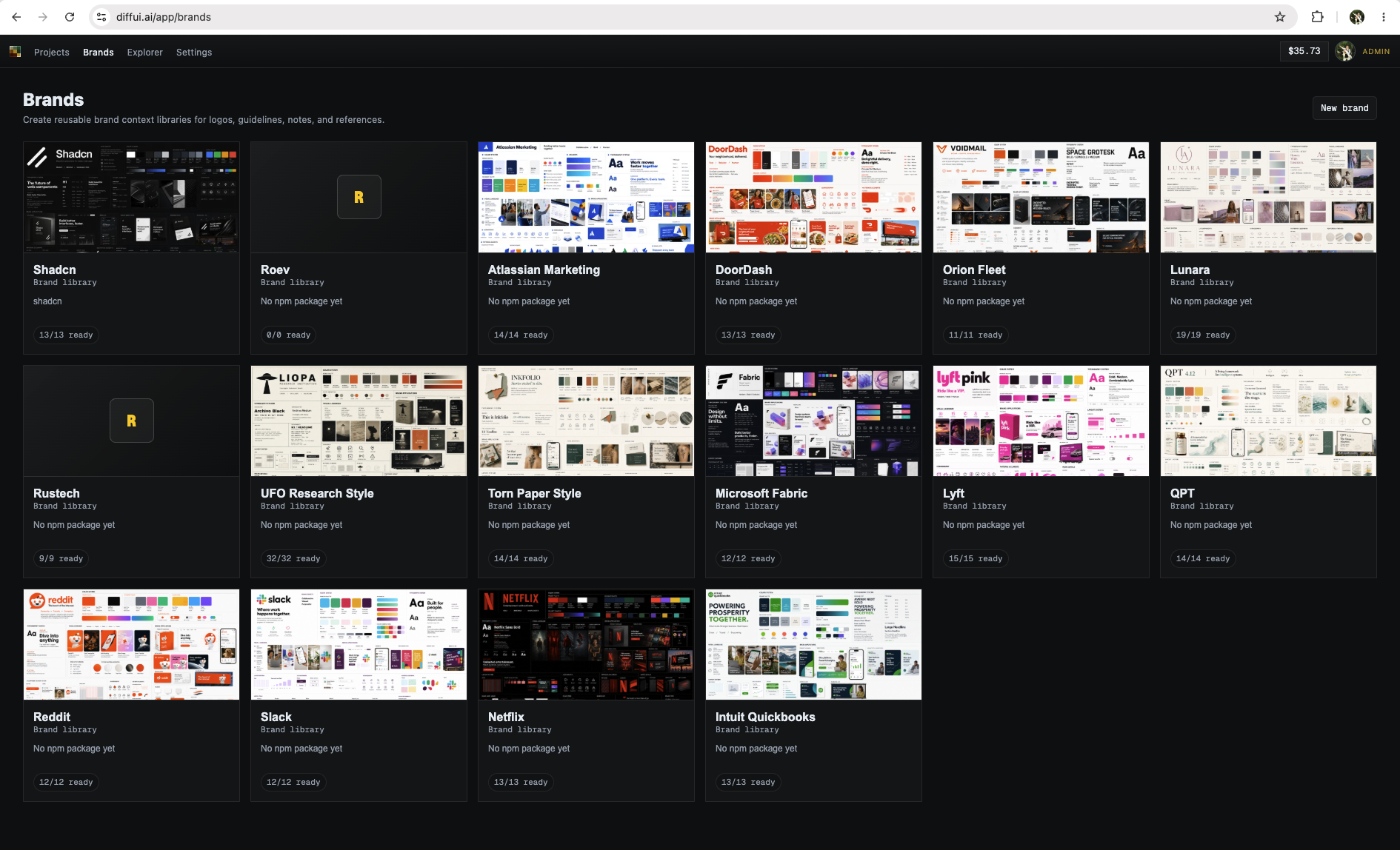
my thing is diffui.ai if you want to check it out. It's basically a harness for diffusion models to generate UI, as well as agent integration for handoff.
That's really nice. Have you tested if it works well with longer and more detailed prompts? For example adding more whole product specs and so on. It would be nice to generate a design system from generated UI you like instead of recreating that UI directly.
RE longer prompts, yes. Generally speaking I expand most prompts to be around a full page of text as it is already, so adding more detail in just refines that expanded prompt. That's more for a single screen though. It sounds like what you're asking about is something like a design.md for an entire brand / docs for a design system.
For that, I have a different approach, which is to extract your design system from screenshots. After which you can just select the brand you want when generating. There's sample images in the sibling comment in this thread.
Also it might be worth noting my pedigree here - I ran the design systems features over at Figma for around 5 years, but quit to build out diffui. The project is heavily oriented towards being able to replicate brands consistently, since the target audience I'm going after is enterprise design teams who are having trouble with existing tools capturing their brand look/feel.
This is an interesting yet simple approach. To the OP’s original question, how might you abstract this into a “design system” that can be applied to their other projects?
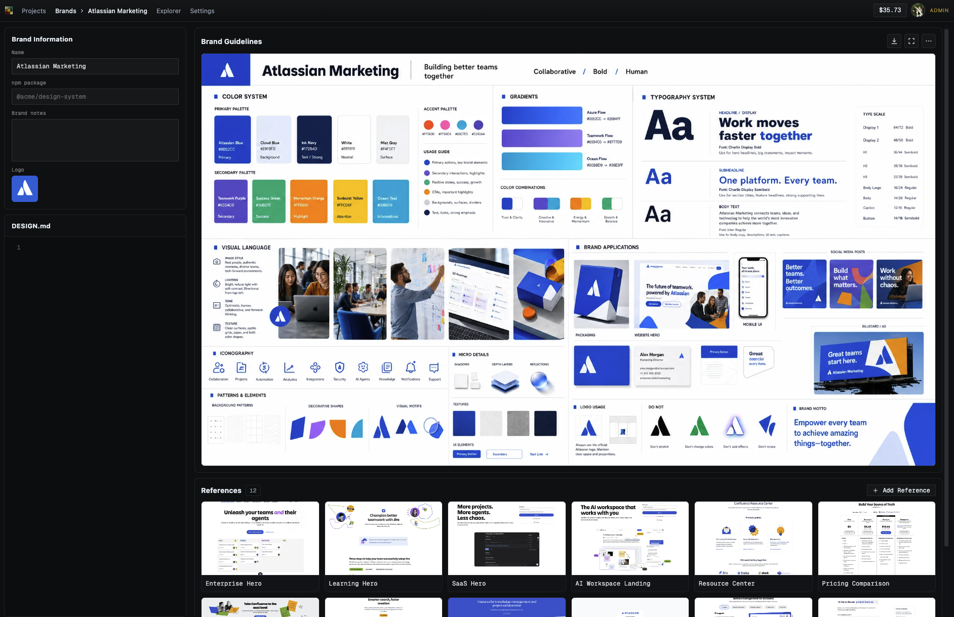
I have a "brands" system that's exactly for this: https://image.non.io/27e099c5-f0d7-493a-a01f-928d9e42cef5.we...
Once you have a few reference screens, you can generate a brand guidelines image, which is a visual reference of your brand's look and feel: https://image.non.io/1cc2922a-aec6-4e3c-82c9-895974dd599b.we...
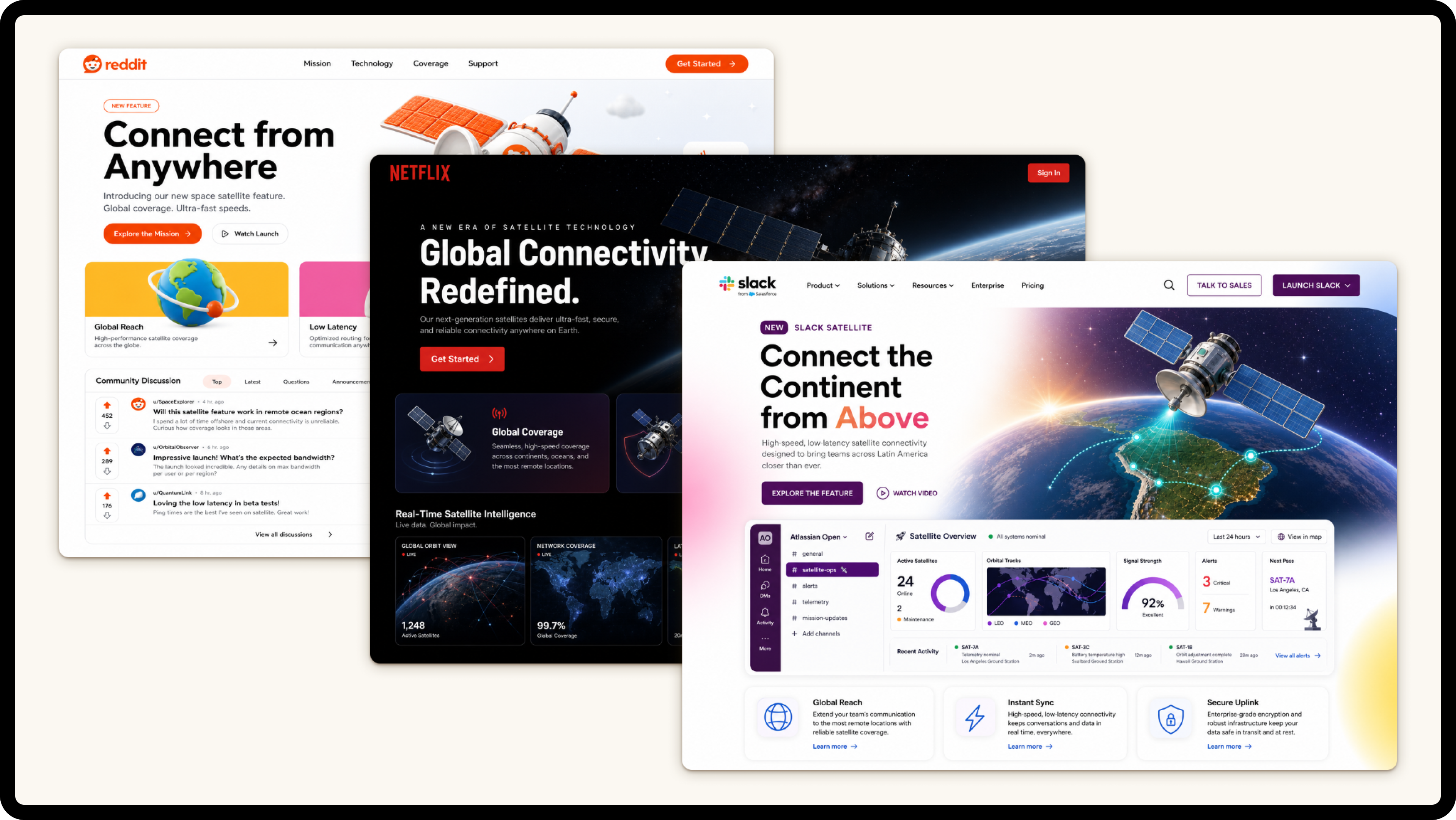
From there you just select the brand at generation time. I've found you don't need a design.md or a npm package - simple screenshots are plenty good enough. Here's a prompt for "a landing page for a new satellite connectivity" feature I generated in reddit/netflix/slack's brands: https://image.non.io/b5e23f19-5041-4f87-9b97-0af39986d1b0.we...
I've been doing this recently - working with Qt on a local app.
I've had good luck providing a png "design board" with all of the template colors and having the first task be to build out a design gallery with all of the ui widget. Then have the design docs specify which component to use. Ensure that the documents specify to only use pre-existing components and have a list of each component and their intended use cases.
Of course, this learning came after seeing how awful V1 of the app was. Initially, it looked really impressive, but once you started clicking around it became obvious how incoherent the design was.
Claude's new frontend-design plugin is solid for web apps in my testing. My wife and I have been using it to build her an app and her discerning design eye is largely impressed with what it's done.
All of these look quite terrible to my eyes. None of them really resemble the classic AI slop landing page, either (of which this [1] is a decent illustration). I'm no huge fan of that style, but it's at least readable and functional, and thus better than the results you got by a mile.
It seems like you were starting with an existing HTML file you asked it to redesign. Generating from scratch with strict guidelines could be more representative.
Agree. I find this route reliably produces better results. Not sure I understand why though. Intuitively I'd think the models would be able to do approximate designs with higher fidelity using code as the primary reference.
I decided to tell the LLM to not generate any CSS for a web frontend I am working on. It is just not worth the hassle and doing it myself is actually a way to think about usability and design in a valuable way, that flows back into how I want the whole service to be structured.
The design coming out of a LLM may be okay if you have nothing to do with design and can't program CSS, I just see a deeply inconsistent mess.
I am convinced well designed software has to be thought out from the user perspective. And if I am the one to commandeer a LLM, designing myself is part of thinking about what I want.
This makes perfect sense. Qt has very clear and strict design rules. Standard web design has too many options. When the AI has too many options, it just guesses and makes a mess. Forcing a desktop style fixes that
I'm currently building a retro styled home assistant control app running on a raspberry pi with a 3.5" touchscreen with all custom UI, and I'm making it vaguely win3.1 styled, complete with color themes including the famous Hot Dog Stand.
It's very satisfying to see these old UI styles - looks great on a crappy little screen. Not everything needs to be Material Design or whatever - it just takes up so much space!
I think the original looks the best and by a large margin
Tailwind is the answer. Always pure Tailwind, not custom classes + utilities. It makes a massive difference vs. stylesheets. The LLM is able to actually reason about your UI in discrete chunks with a semantic layer over the styling, vs. bouncing back and forth between CSS/HTML and trying to reason about custom classes generated on the fly.
I guess this is subjective, but this is almost the meme of the backend engineer with no design taste.
My experience with this is 180 degrees opposite. It's been really easy to create really nice UIs for all kinds of one-off apps I've made for myself with AI. In fact, it has been one of the most fun parts of this whole AI thing. ¯\_(ツ)_/¯
This has also been my experience. I do find it takes a review pass with a direction including things like "make sure text isn't overlapping." "Make sure text isn't overflowing out of buttons" - I find that's a really common one.
Any chance you could share screenshots?
Even the example apps in the post seemed like AI slop to me. Common markers are too noisy/busy (mainly repeated or rephrased information). Text being a bit too big (Codex-only?).
Yes in my experience, AI designs might look okay on first glance but when you really start to look you start to see strange and inconsistent things. Similar to looking at generated code.
You can have it fix these things. It has the tools to analyze screenshots of the app and correct things like formating, alignment, color, etc.
I've been building a personal app with Opus 4.8 over the past two weeks and the design is excellent. I provided it with screenshots of what I wanted, then had it build out a gallery of functional UI elements (like designers do). Claude built out a tool that would screenshot the app, compare it to the design screenshot and automatically reposition elements or update the styles to match.
You can also provide it with a style guideline prompt and have it double check all the work it produced matches the UI style guidelines before committing.
What about a backend that prompts the LLM at runtime and generates a new frontend for every user? It'd be like A/B (C/D/E/F..) testing with no possible way to validate the results or fix bugs. Somebody make me their CTO, quick.
I believe the ideal solution would be to take a genAI image from gpt-image2 and transform it onto a pseudo-deterministic layout.
Did anyone tried a non-naive approach, aka throwing the image with a simple "rebuild it" prompt ?
Does anyone have good examples of well designed web applications - not landing pages or peoples tech blogs, which are often listed here on HN. But like actual applications that do a complex task with the user using it as a tool.
Looks like there is a bug in the "Find State" dialog. If you search "AR" for Arkansas and press the "Set R" or "Set D", it toggles the Arizona state count, not Arkansas
as someone with little to no design background they all look the same to me except the bloated sass which is clearly inferior
is there a way to quantifiably measure how much better one design would be from another?
This article is purely subjective. I'm sure there are some academics that could explain ways to objectively score usability but this article is purely subjective.
No. It's completely subjective.
The whole "AI slop" noise is, at its core, human slop. It is people applying a hopefully pejorative label, trying to appeal to other slop aficionados that like whatever the current trendy slur is, in an objectively undefinable way.
In this case this guy likes the way Qt apps, they think it looks better, but it isn't a big trick they are revealing: They made it conform to the style they like, but this doesn't translate to anyone else in any measurable way. I think web apps looking like Qt apps feel like the late 90s and it's just weird, but my taste also is entirely subjective and mine alone.
Similarly, I've gotten a few reasonable results by asking for Microsoft Office 2007 style or the Windows Vista file explorer, stuff like that.
Most of them don't look amazing, but I like the GTK version the most -- even though it looks slightly outdated.
I thought that AI would at least be good at 2 things: writing (text) and doing UI. It's not good at either. Text it generated reads like slop and UI it creates looks like slop. The way I approach it now is this: for text, I have to write it myself and only use AI to check grammar and catch weirdly phrased passages. For UI, it's like with the rest of the code. You have to stay on the top of it and keep demanding changes to match your vision/architecture/taste until it gets it close to what you want. In both cases, not knowing what "good" looks like is a real problem, because AI definitely has no idea.
I really just want someone to make a decent point and click design library. I don't want to steward an amateur coder I just want to draw exactly what I want out of toolkit of good enough components.
Give me VB6 or whatever for the web.
I am on a mobile browser and the desktopy look of the gtk and qt ones are pretty bad.
in my opinion giving a strong idea helps a lot. just bring it clear in your mind and try to transfer with strong and clear scheme. in my experience this reduces the do and re do thing
To me the "AI slop" mostly just looks like the last decade of SaaS products.
Do the landing pages of auth0.com, devcycle.com, micro.com, or datadog.com not look like slop to other people?
I mean, no these don't look like AI slop. At worst they are 'web slop'. But even with that said a site that looks like this is what I expect these days from most businesses. I'm not looking at these companies for their far out web design capabilities, in fact a site that's somewhat standardized and has things where we expect them is far more useful.
auth0 does get close to slop. If I were them I'd definitely change things up. Devcycle and Datadog are nothing like generated slop. I haven't seen Fable websites yet - supposedly a lot better - but Opus and GPT can't design anything even close to those two. They can implement it if you give them a screenshot, but that's not designing something. Micro.com shows me a domain sale page.
On the practical tooling side — I built a service that does on-demand AI code review (aireviewpro.loca.lt). Interesting observation: the model is much better at catching security issues than performance bugs, probably because security patterns are more well-defined in training data.
On the matter of being without taste -- which I assume the author is using as a self-derogatory descriptor for not having skill in UI design -- the styling of links on this page could use some change. The link color is so close to the body color that I initially thought there weren't any links, and scrolled trying to find the examples. You can't both remove the underline and have such a low contrast font color, it's bad UX.
(For the record, even though I don't mind qt, I think this particular example still comes across as slop because of the overuse of gradients on buttons and headings. In general, a lot of these suffer from overuse of gradients, but OP appears to just be averse to border-radius)
>> Slop is not a distinct style, it can be overlaid on top of many others. Even when I got it to make a page to look like X, it looked like X with slop.
Today, I can visit a website and instantly tell it was generated using LLMs and agents from A to Z:
1. Everything is in blue or mauve gradient, with a white background, and a single JavaScript-heavy page that lags as soon as you scroll a little.
2. There are always a ton of 404 pages.
3. Third, the HTML comments often expose credentials and to-do lists—sometimes even right above the login page (true story...).
This kind of website is a hard pass for me, and I add the company (and its founders) to my personal blacklist of people and companies I’ll never use anything from.
I don't think that is true, in the way that it always wasn't: How would you be able to tell when it's done properly?
Think WordPress installations: Depending on how it's done you can either tell at a glance (probably ~90% of WP installations at some points in time) or you have no clue until you look at the html source.
Of course, when given the option to not do it properly is always alluring and then you can tell.
So you can tell for maybe 20% of websites that have been generated by LLMs over the last few months.
I think its quite easy to get non sloppy looking ui code. I normally start by asking it to follow apple design guidelines, and then customise it from there. The thing that makes it slop, is when you're not specific about what you want. Then it's going to use the "average of all code" designs.
The other things is especially when adding animation, people often prompt "animate the button" which to a developer is very vague and would need alot more work.
Those aren’t “slop”, those are exactly what non webdev used to see in the past decade, now that webdevs are seeing it done without them doing it and everywhere, the reality check hit them hard. Gtk/qt UI feels like duct tape toys even before AI, material is so tasteless but years ago it was the “de facto” in any design or icons set, most front end ui/ux are literally copy paste of the same template and components, even before AI. Imo only some old apple and windows vista where the UI was actually pleasant to see and interact with.
> Only one generation stuck out to me. Simply asking it to make it look like a Qt app - to my tasteless eyes - removed almost all feeling of slop. You can check some of the results out [here](https://envs.net/~volpe/projects/ai-design.html).
All of these examples sites are broken on mobile for me.
Tried macOS HIG for the same reason and got similar results, less slop, more structure. I think what's happening is that the model has a very specific grammar to pull from instead of averaging over everything web-related it's ever seen. The SaaS one is interesting as a control, it's essentially asking for the average of all modern web UI, so you get exactly that.
I kinda liked the Original, HIG and Windows 11 versions the most. When I think "AI slop" (in terms of web design), I think dark theme, rich purples and vibrant hues, huge headings, etc. The SaaS one kind of has that with the purples and vibrant hues; it easily looks the "sloppiest" to my eye.
Personal preferences I suppose.
> I think dark theme, rich purples and vibrant hues, huge headings, etc.
Don't forget the thin and tall serif fonts, with one singular italicized word in the title.
I had to read the post about five times and still didn't see the link to the actual examples - I actually had to view source to see the URL.
I like the idea - all of the designs are pretty meh though. If I had to pick one, I'd pick the HIG one (apart from that cursed glass effect on scroll) and then probably the Win11 one.
I think what makes something look like slop is rounded corner cards with slight shadow, and sans serif font.
Also full caps / overemphasis on text that doesn't need it. For example "DEMOCRAT" and "REPUBLICAN" in this example.
Did anyone commenting about Qt and how it makes sense actually looked at the result?
I don't think any of Qt default themes in last 10-15 years have looked anything close to that. With all those gradients and gray rectangular boxes it's more like a parody of early 2000s x11 theming and Flash based UI frameworks. My personal expectation when hearing QT style would be more like the builtin Fusion style.
If you ignore the central part with gradients, right side with square 3d boxes look a bit like classic win32 style (which would also be what QT used on windows by default) but you wouldn't normally end up with so many nested raised 3d boxes (or visible nested boxes in general). Buttons (and other clickable subcomponents) are raised, tabs are raised, but UI group elements have more of recessed border and you would use it sparingly. Often you would have just a separator line or empty space for grouping elements in flatter UI hierarchy.
Qt is GUI framwework for C++. How would having a bunch of C++ code containing barely any styling in training material help styling a website? Also the whole point is that it's a style that you don't recreate it hundred times it's what you get automatically by letting the GUI framework and theme engine do it's work. The modern Qt with Qt Quick/QML and it's flavor of CSS is closer to web development but those kind of Apps lack any kind of characteristic QT style since the authors are more likely to build the styling from scratch (resulting in one of those UIs with random image in background and hardly recognizable widgets) or based on builtin Qt versions of Google/Windows/Apple style guides. Wouldn't expect any modern QML based app to look like the obtained "Qt" style. In the traditional desktop apps based on QtWidgets, you can customize the style with css but the hard coded logic within the theming engine (implemented as native dll) is equally important for the look, not everything is is defined by css. You have to do either very little customization (minor styling for individual special elements maybe a color pallet swap) or override everything, otherwise it's easy to end up with ugly, broken result. Typical problems being Qt changing default base theme based on platform, theme engine switching to fallback rendering path once you override certain style properties.
Another important aspect of the classic desktop look which doesn't really translate well to websites is the set of widgets. Frameworks like Qt(widgets) provide reasonably wide range of widgets and you would use them as is. Unless you really needed it rarely would you create a widget from scratch or recreate what's already available. You wouldn't recreate a button, checkbox or a dropdown(combobox) using bunch of divs which can't be said about the modern web design. You might customize the behavior of builtin widget with subclassing or by combining multiple builtin widgets. The API for drawing custom widget from scratch is a pain and using it correctly to properly integrate with theme engine is even bigger one.
I think the slop part is just what you get when you inject no opinions and put in no effort to apply taste (which you probably have and/or could develop). No care is put in. It looks generic and sloppy because it is generic and sloppy. You might have preferences over which generic and sloppy style is preferred, but at the end of the day a UI built without effort is going to look like what it is.
But if it functions fine and you don't have taste or want to be opinionated, why do you care?
You went from slop to outdated (as far as looks are concerned). But hey, what's old is new again, maybe we'll come full circle again.
My eyes are so sharp i can easily tell which one is slop coded whether it is QT or GTK style theming lol.
Welcome to a new design process called “Hacker News in the loop”.
Makes sense. Slop is basically what you get when there's nothing specific to copy and so the AI it just averages every web style together. Qt works because there's really only one way Qt looks.Modern web has a million versions of everything so you average all that and get slop.
on the other hand steve jobs would've called Qt human-slop
guess it's a matter of taste
design.md
[flagged]
[flagged]
[dead]
[dead]
TLDR: Once a design gets old enough that LLMs can reproduce them, they are now "slop".
This seems to be a new iteration of what IMO made frontend work somewhat painful for almost the entire time I've been building software. It used to take the form that people did something with html that it wasn't designed to do. That thing looked cool and so everyone wanted it. This lead to pain and the perception that the tool is inadequate. So we eventually got CSS. And it continued there. Someone figured out a way to get cool dropshadows and rounded corners. These were cumbersome to implement. And so on.