Mercedes-Benz commits to bringing back physical buttons
drive.com.au724 points by teleforce 20 hours ago
724 points by teleforce 20 hours ago
I’m quite suspicious that they do that not because they understood or learned something, but because China requires physical buttons starting next year. And they simply don’t want to lose one of their biggest markets.
Despite China, IT development is a complete disaster in Germany. All car so called German car manufacturers UX/UI is horrible to say the least.
Dieter Rams is the only UX/UI designer, who became famous - outside of Germany. Hartmut Esslinger kind of popularized DR, what an irony, that two Germans made history, but of course not in Germany and even in Germany DR wasn't well known. Braun was a brand and statement, but because the devices were and still are extremely convenient. Braun never put design or beauty in the spotlight - it wasn't recognized as such and therefore not of value to capitalize on.
VW? "No one needs Apple Car or Android. We are the world wide Nr. 1 in car business, what does a computer company know about cars? hahaha"
Hubris, resulted into a failed attempt to build in 2 years a complete Car OS. It was so bad, I was mocked back then, because I bet against it.
I am the only one who successfully build a No Code platform in financial services that became such a hit internally, that it became the standard. dbCORE is its name.
Very long story, but design by committee is the norm in Germany, and since outsourcing is the way to go, vendors sell changes all the time otherwise they lose the customer.
Value chains like Apple or Google are inconceivable and no one in Business has a background in CS.
Porsche 997-2 had the best UX/UI there was. Fantastic blend of nobs and touchscreen. It blew my mind, really. This was 2008. The iPhone came to light 2007!
Really, highly impressive, extremely functional and almost no friction at all. 90% was top.
And to the haters: Show me any company or product from Germany in IT that is Top 100 globally. Only SAP is or has been featured somewhere below the bottom. And I gurantee you, no one fell in love with its UX/UI...
> And to the haters: Show me any company or product from Germany in IT that is Top 100 globally.
Also I wouldn’t want to disagree with you outright, there are still a few important German companies in the IT sector (or related): Siemens, Infineon, Deutsche Telekom, Bechtle, TeamViewer come to my mind.
What Siemens exemplifies is that the strength of German industry is not pure software, but high-tech machinery. While Siemens and most of its spin-offs are doing somewhat okay, the stocks of its spin-off Siemens Energy have risen by ~700 % in the last 3 years.
Where Siemens really shines, is in their fanatical devotion to after sales.
I rely on Siemens automation products at work. They give me end-of-life warnings a couple of years ahead - and maintain a spares inventory for a decade and change after EoL.
That basically ensures I am never caught out, and makes me more than happy to (grudgingly) accept all their ideosyncracies...
I assume it makes you a loyal customer when upgrading/replacing equipment too... knowing what to expect and that you're going to have all of that support.
So many product companies fail to think about that -- they're all thinking about this quarter and very few take a long term approach and really try to have customers for life. They all say that want that of course, but too few are really committed to it. There are a few brands that I buy that are committed to quality, and they usually cost more (initially, but probably not in the long run). I'm fine paying more know that they really tried to do their best and didn't let nickels and dimes get in the way of an otherwise great concept.
Technically SAP is a Société Européenne but still somehow the biggest German software developer.
What matters is where the headquarters and key employees are. SE can be based anywhere in EU and even then legal entity stuff isn't what matters.
Origin: German, HQ: German, Accounting regime: German, Main stock listing: German, Executive board: 5/6 German
In fact, you can run any form of European legal entity from any country. I.e., I can create an spółka z ograniczoną odpowiedzialnością (sp. z o.o.) in Poland, but run the business in Germany. It would be complicated and stupid, but legal.
>a few important German companies in the IT sector (or related): Siemens, Infineon, Deutsche Telekom, Bechtle, TeamViewer come to my mind.
None of them famous or being praised by customers for having amazing UI/UX though, because they're not consumer products, they're targeting engineers who either don't care about UX, or don't have a choice in the matter because their company is buying it, not them.
Cars on the other hand ARE consumer products and do need great UX, and German companies long forgot how to do that since they operate everything as a cost center and outsource everything they perceive ads no value.
>the strength of German industry is not pure software, but high-tech machinery
Yeah but there's more margins in pure software and more buyers in the world for consumer devices than for high tech machinery. Apple can probably buy all of Germany's machine tool makers if they wanted to. It's the perk of selling to 7 billion consumers in the world.
> the stocks of its spin-off Siemens Energy have risen by ~700 % in the last 3 years.
Just like every energy and defense stock in the world right now, but that's to be expected and somewhat offtopic for SW and UX.
If we look at some of their other consumer and healthcare spin-offs like Gigaset or Healthineers, they are doing insanely poor, which is embarrassing.
They havent totally forgotten. I drove a 2025 BMW last week and noticed many similarities to my favorite car, the '92 325IS. The speedo and tach both aligned in top gear, the thumb hooks were still perfect, and the cluster still dimmed enough for night driving. Someone at BMW remembers how to do UI.
Software in Germany is simply not highly regarded, on the contrary. It is seen as necessary evil at best.
Ageing population that finds itself overwhelmed is my guess. There are exceptions, but they are far and few between.
My 992.2 has AA/CarPlay, and an outstanding user interface, with a nice mix of configurable displays and physical buttons. Fairly certain it is a top 100 product in it's market.
Yes, I think Porsche has a responsive excellent design with their infotainment / button combination though recent SUV / sedan models have moved to capacitive buttons and more touch screen controls and worsened the experience.
To be fair, it is outsourced to Harmon/Kardon.
> it is outsourced to Harmon/Kardon
Many automakers use them for their headunits (ex. both my Chrysler minivan and my Porshce have HK headunits). The headunit in my porsche is also in some VW models and for the HN crew there are some fun hacks you can do with a usb stick to customize some features, including making carplay fullscreen (tap the porsche app to return to the porsche UI)...
Last month I spoke to a woman driving a Porsche SUV. I was appalled to hear that she is trading it in for a Tesla model Y. I drive a Tesla, and I love it, but it is nowhere near the level of a Porsche. She claims that the model Y is quieter then the Porsche and she loves the self-driving. I advised her to take the Tesla for a long test drive before selling her Porshe, she said that her son in law has one.
That isn't surprising for most people. It is also hard to say without knowing which year and model Porsche she was driving. Someone with a Cayenne Turbo GT will have a different experience from someone with a 1st gen base Macan.
A juniper Model Y is very fast, no engine noise, can drive itself better than a lot of cars on the highway for a similar price, doesn't need gas - convenient if you have a fast charger at home/work, fewer moving parts to think about in your day to day and control.
I like knobs and AA and will never make that trade... but it makes perfect sense for many people who don't mind the interface.
I'm glad Genesis still has knobs and Lexus is getting back to that now. The German luxury cars can't rely on fantastic engines alone forever.
IME the juniper model Y has crazy road and wind noise, it’s certainly louder in the cabin than my S63 which has a V8.
Fast? Sure.
Little she knows that if she uses the “self driving” from Tesla she may get into a death trap.
It is true though. The level of porche is in the brand only; there isn't a single porche that is better than a juniper for a daily driver. She's making an excellent choice.
Did you somehow get a juniper which doesn’t suffer from significant road and wind noise?
Marketing beats quality, also a valid approach.
Also a reason why suvs and their more ridiculous variants picked up so well. People don't need cars that are worse to drive, but sure as hell they want one because others have them.
Does Tesla do marketing? They don't advertise in my country.
Tesla historically focused on what marketers refer to as "earned media" rather than "paid media", but it was still marketing. Those Musk and Tesla headlines that happened around the world didn't occur by accident.
That said, they've also been buying ads for the last few years as their growth has sputtered in the face of competition.
So you want me to put my big luggage, 3 carry ons and a big stroller in a sedan trunk?
That has nothing to do with the conversion. However I've actually fit all that and more in my Model 3 Tesla. The trunks are huge.
The cup holder situation, on the other hand… (992.1 owner)
My favorite car was a 92 BMW 325IS coupe, standard. It was a simple driving machine. It drove well. It performed when asked. It had room for four, or three plus skiis with half the rear seat folded down. And BMW took a strong stance against drinking and driving: zero cup holders.
I miss that car. I would buy one again in a heartbeat if BMW still made them.
My E36 was fantastic as well. Automatic climate control, heated motorized mirrors, heated monkey pissers, heated power-adjusted leather seats, power windows, power sunroof, dash lights that fluidly adjusted to ambient conditions, two throttle bodies (in series -- one for the loud pedal, one for the ASC+T), and a single-DIN radio that was dead-nuts simple to upgrade properly whilst leaving the rest of the factory system (and its 10 channels of amplification) intact.
That's a pretty long list of things for a simple driving machine.
But anyway:
It came with two cup holders in the center console, BMW part 51168205367. There were two more cup holders in the middle armrest for the rear seat. Two additional cup holders were also available, which fit under the top of the glove box -- BMW part 51168184470.
I loved that car and it was brilliant to drive, but it did not represent a "strong stance" about drinking and driving.
It was a rather complex machine that came fitted with plenty of cup holders. :)
Sounds like you had the north america version. Mine was built in Europe, first sold in canada. It had to be dealer-modified for daytime running lights before being first sold (headlight switch "off" was turned into another on.)
I've had to give up drinking trenta-sized Starbucks entirely.
I found an add-on cup holder (similar to one I had for my NSX which had none from the factory) that clips behind the inner center console panel and the cup sits on (or near, depending on diameter) the floor. Unfortunately it is expensive for being a 3D printed part that needs better QC (had to sand the changeable cup part) (the NSX one was aluminum) but it works very well.
A better design would be to have a smaller diameter clip-in piece so you can size down when you have a smaller item.
see my comment about shopping for a used Macan, and avoiding 2022+ with the haptic BS.
> Only SAP is or has been featured somewhere below the bottom.
“The company is the largest non-American software company by revenue and the world's fifth-largest publicly traded software company by revenue. In June 2025, it was the largest European company by market capitalization, as well as one of the 30 most valuable publicly traded companies in the world.”
High market cap but universally hated by its end-users is probably not a great yardstick to measure consumer software against.
> VW? "No one needs Apple Car or Android. We are the world wide Nr. 1 in car business, what does a computer company know about cars? hahaha"
VW was supporting CarPlay from launch and the VW MEB dash was on all pro material of Apple for ages.
Ever heard of CARIAD, the biggest trainwreck, er carwreck, of a software company south of the north pole?
6000 people to develop a software stack for VW.
Go figure. The fact VW supported CarPlay early is footnote in this comedy.
Not sure how CARIAD is relevant here. That company was started years after carplay landed in VAG.
Nowadays those 6000 people don't even develop anything, they do outsourcing.
Well there’s Bosch. Software wise I salute their home connect initiative which is maybe not the best UX but at least it works locally so either it is good forward thinking software engineering choices either it shows neglected software engineering practices.
No disagreeing with your points. I can see the passion in your reply :)
But Hetzner Cloud UX/UI is wonderful, compared to the rivals, Digital Ocean, Google, AWS (yea those are bigger and offer more, but still)
Not IT, but I think Leica has the best camera design. At around the Leica M6 they decided that the design was done, and every future M camera is essentially an M6 clone.
Not a hater, just an example from today’s HN front page: Ableton from Berlin. World class UX/UI leading the DAW market for 25 years and counting. Not “Top 100” enough for validation? Just ask Thomas Bangalter. He’s taken it around the world to get lucky.
> And to the haters: Show me any company or product from Germany in IT that is Top 100 globally. Only SAP is or has been featured somewhere below the bottom.
Much as people seem to dislike when I say this, but, Europe simply cannot compete anymore in technology and tries to legislate away its problems, which, while sometimes something good does come out of it like the DMA, it does not help long term when there are no good home grown big tech (or indeed, any sector in the top 100) companies of their own.
When European Union tries to regulate the influence of US companies in Europe and establish some European digital sovereignty, US government comes to help and applies pressure on European Union.
" “To start a direct confrontation with USA right now is probably not the smartest way to react,” said Christel Schaldemose, the Danish social-democrat lawmaker who led the drafting of the Digital Services Act."
https://www.politico.eu/article/jd-vance-waging-war-eu-tech-...
"Europe" is about 750,000,000 people in about 50 countries. There are huge differences in both culture and economics between one country and another and often even among different parts of the same country. It's probably not a great idea to generalise to "Europe simply cannot compete anymore in technology and tries to legislate away its problems".
One of the main reasons Europe doesn't have a lot of big tech companies is that a lot of its most innovative and successful companies get bought out by the giants in the US before they reach that scale themselves. I expect this is going to happen less in the future because of the recent shifts in opinions though.
Or maybe they leave voluntarily, because the EU is simply not a place to do business? Because the EU has been regulatory-captured by aging tech entities such as Siemens, IBM and SAP?
Mistral, Zendesk, Basecamp, etc. left Europe for the US early on. If we take into account European founders who started their companies in the US right away, the list is even longer.
The EU and Europe are different. 27/50ish (depending on who you ask) countries in Europe are EU member states and they collectively have about 3/5 of the European population.
My own country - the UK - is (in)famously not a part of the EU and I don't think anyone would seriously claim that we have no technological innovation or successful tech businesses here in Cambridge. The city is practically overflowing with tech startups either spun out directly from university research or keen to employ people from the local tech community.
But what tends to happen is that when one of those companies reaches a certain stage the founders will cash out. Not everyone needs to be the next Bezos or Musk. Not everyone needs to see their company of 20 or 50 or 100 people grow to 5000 with international divisions set up before an eventual IPO. Not everyone wants to go through multiple rounds of VC funding and then have to run their company under the influence of the VC's people on the board. There are a lot of founders who would be very happy to take an eight figure payday after 10 or 20 years of working on the business and then have no need to work any longer if they don't want to and the freedom to do almost anything they want for the rest of their lives. I've personally known a few of them. Some did effectively retire. Others later started something new. But one thing I don't recall a single one of them ever expressing is regret over the timing of their exit.
If anything I'd say what is missing here is a culture where people feel the need to carry on past that stage in their startup's growth. And so instead of that successful business continuing - perhaps after some other form of exit for the founders - as a local company that might eventually become big enough to buy up other successful startups we instead see them get taken over by companies ultimately run from the USA because they're the ones with enough resources for an acquisition at that scale. Of course there have been a few that did become much bigger before an eventual exit - ARM is probably the most obvious one locally and for all the tragedies in the Autonomy story it was another - but they are the exception and not the rule here.
To come back to the car business we were originally discussing today - I doubt very much that we will build the next Tesla or BYD or even Polestar here in Cambridge - but I could easily imagine a startup here developing the next generation of car control system and then selling the IP to one of those companies as the exit strategy.
BMW's latest infotainment despite being intimidating for first time users is quite decent and intuitive compared to the horrors I saw from other German car makers.
Apple Car and Android Auto are on VW cars since a decade.
Comments about this dreadful UI/UX on german cars feels really decade old.
In any case I rent cars quite often, mostly get Korean, Japanese and German cars with few rare US ones, and I really don't see those differences across the board software wise.
They all suck, they are all slow, clunky and unintuitive.
They are all like TVs. The native interface sucks, you plug Apple in and it's suddenly good.
I have never used the native UI of my Samsung Frame. I haven't used any car's own navigation or music app in at least a decade.
Yep, except on my TV I don't have to leave Apple TV to adjust my climate control every time.
(Mk8 GTI)
I drove such a VW. Once. I still get annoyed when I'm reminded of it!
I couldn't help myself and just watched a video demo of it https://www.evshift.com/242850/how-to-adjust-the-heating-and...
The actual rage it induces LOL!
Engineers in Europe are essentially pariahs, a necessary evil for corporations hiring them. Sure they earn more than cleaners or teachers, but not substantially more. Difference between being able to afford 2 visits in restaurant a month rather than just 1.
This means engineering is not attractive and no longer something to build life around.
It takes years of learning, patience, trial and error for not much different remuneration than jobs requiring far less commitment.
> All car so called German car manufacturers UX/UI is horrible to say the least.
What?
My BMW i4 has iDrive 8.5 and it's excellent, and i've had Mercedes and Audi and VW and Honda and SAAB.
the BMW and the 40 years ago SAAB (i bought it very used) both were easy to operate without looking away from the road.
>And to the haters: Show me any company or product from Germany in IT that is Top 100 globally. Only SAP is or has been featured somewhere below the bottom. And I gurantee you, no one fell in love with its UX/UI
Games count I suppose?
Nah, 991.1/981 had the best UX/UI. It used screens for the controls that need to be on screens (navigation and entertainment), and physical buttons for everything else.
There needs to be a screen, but it should be used only for optional features. It shouldn't be required. The 9x1 generation got that. In the 992, you can't even open your garage door without fumbling around with the stupid touchscreen.
VW? "No one needs Apple Car or Android. We are the world wide Nr. 1 in car business, what does a computer company know about cars? hahaha"
I have no idea what you are talking about. I think all recent VW cars (since 2018) support Apple CarPlay and Android Auto. CarPlay works great with our VW ID.3.
Also, since a refresh a few years ago, the in-car system has had great UX/UI. We are perfectly happy with it and this is after almost two decades of iOS + having tried the systems of various different cars (including NIO).
We do not have anything to complain about, except more physical buttons would be nice, but the latest generation is bringing them back (e.g. the new ID.3 NEO). We are considering upgrading to the ID.3 NEO soon (or maybe Hyundai).
The facelift/software that was introduced with the ID.7 is really good (especially the navigation system with AR HUD), but you kinda have to consider that the HN user population is extremely US-centric and IDs aren't really available in the US, so I don't think it's surprising that the opinions on HN lag behind reality by a couple years there.
Total nonsense you’re spewing here. Especially for it being very country-biased in a world where giants like Volkswagen and BMW are highly international.
https://www.bmwgroup.com/en/innovation/innovation-network/te...
For example, BMW tech offices exist in Silicon Valley and Shanghai, among other locations.
German cars have been very well-regarded in terms of their automotive interfaces by the automotive press and reviewers as well as customers.
Watch any Doug DeMuro [1] video and on the subject of infotainment systems and you’ll see that BMW and Mercedes are up toward the top in terms of usability and customization.
You’ll see brands with good technology reputations like Kia refuse to put a GPS map in the gauge cluster while the Germans have been doing it for a decade plus now.
I will also remind us all that Mercedes beat Tesla to market on level 3 autonomy.
The only companies beating the German brands on tech are EV startups in China and companies like Tesla, but of course those companies are doing so mainly because they are replacing physical buttons with that technology, and generally integrating a lot of gimmmicks that are low hanging fruit compared to the things they can’t replicate as well like driving platform dynamics.
[1] I choose Doug DeMuro for this because he’s somewhat “in the middle” on technology. He prefers touch screens over purist physical controls for many functions but isn’t wildly biased toward them or incredibly tech savvy like the kind of person who blindly embraces Teslafication. He’s the kind of reviewer that will miss the “but actually there’s a setting for that” solution for his nitpicks, effectively showing the car as an layperson who isn’t techbrained but also isn’t your dad who wishes the screen was gone entirely.
Where driving platform dynamics are they offering that helps normal people (not talking about car junkies here)??
All the provide is a squeeze money scheme by making everything paid upgrade, laggy software, buggy software, bad range and much more.
There's nothing good about most German cars anymore. Bmw neu klasse is finally a decent answer but it took how many years?
Actually... My 2016 Skoda Rapid let's me update the map for free through a user removable SD card. Pretty great UX compared to every other car I've ever had the displeasure of having to navigate with. Software is nothing special otherwise, but gets the job done. Car is 95% physical buttons through.
Also, my 2020 Mii Electric is 100% physical buttons. Pretty great.
Frankly, I am wary of anything but VWAG at this point.
100% agreed. I think it's safe to say that good software UX is incompatible with the way German hardware companies are generally run.
It's the same old story about how hardware companies can't do software UX, except extra amplified because of the strong emphasis on hierarchy, formal degrees and their, errm, heavy processes.
I hadn't heard of this china regulation.
Perhaps we will have a "Beijing regulatory effect" positively impacting the world like the Bruxelles and California ones.
Already happening, best example is worldwide grounding of Boeing 737 MAX. It was China who triggered it, not US authorities (protecting US corporation).
Similar thing with batteries on airplanes, tube trains, ferries and underground garages. China cares about fire hazard, other countries care about ideology.
> other countries care about ideology
Not even ideology anymore, see US. Democratic country has been attacked in a biggest war since WW2, and they've decided to halt all support and attack Iran instead.
China, famous for never putting ideology over policy.
unless you're going back to the cultural revolution, modern China is extremely pragmatic. It's a nominally socialist country that runs deregulated special economic zones with tens of millions of people and more economic competition than anywhere else.
The equivalent would be if the US started to run a socialist planned city of 15 million people somewhere, just for the sake of it. There's pretty much no other place that in the last 30-40 years has as much of a spread of policy experimentation as China has had.
Too bad they don't care so much about factory worker safety or slave labor
I don't think the bake-off to decide which superpower has the worst human rights record is going to land where you want it to. Hint, they both suck.
FWIW, I'll take the one not dropping bombs to keep their BFF happy, boosting right-wing shitheads, threatening to invade their real allies and slapping dumb tariffs on everyone.
They both suck, but one of them literally harvests organs from political prisoners.
I’m honestly torn on which one I’d pick, but there’s a TON of likely state-sponsored pro-China propaganda on the internet, so I consider it a patriotic duty to push back for the sole reason that we can still freely talk shit about the one (for the time being, as long as you don’t mention the blessed martyr Charlie Kirk), whereas the other blocks the internet and imprisons people for dissent.
Wow, that's amazing. What fire hazard are they preventing in their support for Russia's illegal invasion of Ukraine?
It’s funny you say that because the China “anti regulatory effect” of the 90s-2000s also had a great impact on quality of life for the world in its own way
Euro NCAP will also only give the highest safety rating to cars with physical buttons for common functions.
Dunno, people hate the all-touch trend so much (I've never come across someone who likes it), it surprised me it took them so long to reverse course.
It seems cyclical. Maybe the people who stand up for good UX retire and it takes a few years for a company to realize that they're going in a bad direction.
Mazda used to have do the best most user friendly controls and bragged about it as a differentiator... but the new cx-5 is a touch screen-only monstrosity
Anyone exec wanting to move away from touchscreens and back to buttons would have flashbacks to Steve Balmer mocking the new iPhone and stabbing his fingers at the touch panel and making a fool of himself for eternity.
I have an Audi Q7 and a model X. Don't miss the physical controls of the Q7 at all. Given a choice between Tesla software and Android Auto, I'll take Tesla's.
Then again, I'm someone who likes the yoke steering, and invested a few weeks acclimating to the lack of steampunk turn stalks.
For physical controls, it always comes down to "What did you want to do?" There are very few that are actually needed.
well their F1 yoke uses lots of buttons, and makers often roll insights from F1 into production cars
https://sim-lab.us/cdn/shop/files/mercedes-product-image.png...
So what’s the next link in this chain why is china ‘really’ requiring it?
But do you have to look at the display to tell what the buttons and knobs are doing.
If you have, say, a HVAC fan speed knob with mechanical stops at the low and high end, and a detent, you never have to look at it. If you have an increase/decrease switch, you may need to look at the display to find out what you're doing. In a car, this means head-down time, eyes off the road.
I have a Black and Decker branded humidifier, which comes from "W Appliance Ltd", a licensee of the Black and Decker name. It's an ultrasonic humidifier with a 1.45 gallon tank and a big filter to remove dissolved solids, so it runs well on tap water. It's an effective humidifier.
This device is an example of how to botch the user interface for a very simple device. There's a big round display, about 12cm across. This has various dedicated icons and a central number display. Around it is a ring which displays a moving bar pattern when the device is running.
From left to right, we have five buttons. They're just touchable areas on the case, not actual pushable controls. The first button is On/Off, and, inevitably today, the same button does both functions. The display lights up when on.
The second button turns on a negative ion generator. This isn't an advertised feature, and it may not actually do anything. If this feature is on, a tiny icon illuminates on the display. This thing is down on the floor and you can't see the smaller icons without getting down on your knees. If you hold this button down for two seconds, the decorative bar pattern on the display is toned down, but not fully turned off.
The third button is fan speed. Available values are 1 to 3. Default is 2. 1 is useless, and 2 is mostly useless, because the water condenses on top of the unit rather than humidifying the room.
The fourth button sets the humidity. Values from 45% to 90% can be cycled through. There's one two-digit display, and it shows the humidity being set when the button has been pushed recently. Otherwise it shows the humidity being measured.
The fifth button sets a timer to turn the thing off after some number of hours.
When the water tank is empty, a tiny icon illuminates. The main display does not change or go dark. The one actionable piece of info the device can give the user is barely visible.
Removing the water tank or turning the device off resets all settings to the defaults. So after each refill, the user must go through setup again.
There's an optional remote available, with the same five buttons.
All this thing needed was one big knob for setting the humidity, with an off position. Plus a nice big indicator light to indicate an empty tank. Instead, they designed a complex user interface that makes it worse.
This kind of mistake appears when UI people design button systems.
I think they should distinguish between controls and settings.
Settings are great on a touchscreen. A wide variety of options, easily navigated to and explained. They suck on physical buttons, it ends up being like setting the time on a VCR.
Controls on the other hand deserve physical buttons. Or levers. or dials/knobs/spinners. It should depend on muscle memory, and the type of control.
I also thing driving status should be on a dashboard in front of you, not on the central display. (looking at you tesla)
And some should be multiple places. It might be nice to set your volume with a physical knob, but also on the steering wheel.
I have a pre-facelift MB A-class, and I think it's the best car I've driven for controls. You don't have to touch the screen ever if you don't want to: there's a trackpad on the centre console that just works even (most of the time) with Android Auto (and the back/home/map/media/phone buttons will still save you even if Android Auto won't always let you move the cursor to the back arrow in YouTube Music). The steering wheel has two touch-sensitive buttons, one for each screen (duplicating the trackpad, which itself duplicates the media touchscreen). I can't even easily reach either screen when driving, so I don't.
Driving controls are all available on the stalks and wheel, volume is adjustable from the wheel or the centre console, all physical buttons, levers, or scroll inputs, unless you need to change a setting using the trackpad. The only thing that's missing is wheel control for skipping tracks :P.
And then in the facelift they replaced the buttons on the steering wheel with touch sensitive ones and just removed the touch pad and replaced it with nothing. It's still useable and nice, but worse than the older model and there was no need to change anything.
I used to drive a 2001 S-class ... easily counted nearly 100 physical buttons within reach of the driver. In theory you could use the 10-digit keypad like an old flip phone to enter a physical address into the navigation, but is that really what people want to go back to?
I missed navigation.
I think it is a natural fit for the touchscreen. Tesla navigation is not perfect, but it is very good. You can pan/zoom the map with swipes which is LOTS better than buttons. You can also search for an address in specific or general terms and are not forced into some highly structured address format.
For example a ford I used had this weird out-of-order way of "enter street number" or "enter zipcode" and "enter street name" with a weird type-ahead/completion that was just... bad.
With tesla, you have a search field. You can type "123 main street, anytown" to find a specific address, or "home depot anytown". But you can just type "home depot" and choose from the list which puts recent on top, then closest to furthest. They also show up as pins all over the map and you can just choose one.
I guess you could also use voice nav. I kind of hate voice nav that is uploaded to the cloud (and they lie) I have an offline garmin car gps that lets me talk to it.
this is an incomplete picture though. Would Google Maps be considered a control or setting?
both. the map has many detailed settings which you might change once in a while.
there are also certain things you’d want to change (or activate) often - we could argue those are controls. Like muting, changing volume, or finding a nearby gas station.
And for those commands that do not deserve a physical button and are only accessible via touch, please adhere to a few simple rules.
1. Put them always in the same place. Especially the "back" or "exit" button!
2. Each button should do one thing, not switch between 3 or more modes that you should look to understand which one you've just activated. Negative example: one button to cycle from cuise control, to drive assist, to speed limit, and back to off.
3. The area where a tap is interpreted as a button press should not also be where a swipe is recognized. In moving vehicles it is too easy for your finger to swing just an inch before touching the screen.
4. The active area of a virtual button must be large, larger than the icon it displays, so large that you shouldn't be distracted from driving just to aim at it!
Also - move the tech forwards! Buttons can be cool. Software controlled detents for rotary encoder knobs, back lit stream deck style buttons, cool knobs that combine twisting and pulling in/out.
1. Drives me crazy on iPhone. On Android there is one button to go back. Very simple. On iPhone sometimes it's top left, some times it's called 'done'. Sometimes the app doesn't have it at all and I have to use a menu instead.
Last time it was VW bringing it back, then Mazda bringing it back, and so on. Also luxury cars will not use touch controls, thats only for cheap cars.
It appears wishful thinking that physical buttons are coming back. This would be an idea whose time has gone. It does not even matter companies that physical buttons are better, or they can offer as choice (at higher price) if someone wanted.
Like remote working, office cubicles, fast and lightweight websites, ad-free content, one time purchase software incentives of all parties are aligned against people who bear cost of these decisions. So I do not expect this to change.
But VW are bringing them back? The ID.Polo (seems like they dropped the Playstation style incrementing number for the old brand names) is the first of their new electric range with physical buttons for windows, climate, etc.
Basically the door and centre console have them back. Along with a touchscreen of course.
When did Mazda get rid of buttons? They always provide both choices no? Touchscreen and the dial (which I love). Temperature controls are also physical.
Except for the new 2026 models. I think those removed physical buttons
I think you answered your own question. 2026. My 2025 CX-90 has amazing controls.
Even Toyota is going touch now, with the 2026 models lacking climate control knobs.
I don't know why. Every review always praised the previous models for the physical buttons, and literally nobody asked for them. The physical buttons were perfect, yet they've taken them away.
There must be some grand anti-button conspiracy, it just doesn't make any sense.
Chasing trends and it's now cheaper to have a single touchscreen with software controls than to design and manufacture physical controls.
There’s less need for a physical button for those things now that climate control algo has become so good it has been on Auto the entire time for me.
A screen costs 75, a button is 1 each. You get a lot more that 100 buttons on a screen.
Not to mention the physical space a button takes.
I'm looking at buying a used Porsche Macan. Through 2021 they were absolute button-fests, with a console absolutely littered with physical buttons.
In 2022, they moved to a piano black console with haptic "buttons". It also seems like there are somehow fewer of them; I'm not sure if more functions moved into the touchscreen or what.
Anyway, needless to say, I have no interest in the 2022+ with the haptics.
'He also explained that "I'm a big believer in screens, because I really believe if you want to connect, you have to make the magic work behind the screen." '
I am a big believer in keeping "product people" away from UI design for dangerous machinery.
The eyes and the attention of the driver should be on the road. All the audio visual noise from the car is just plain dangerous. I don't want my car to draw my attention to itself for anything less than a critical engine/tyre pressure failures. I do not want beeps on anything else distracting me while I am driving.
My Volvo will, for instance, flash the same type of visual alert when fuel level is low (permanent "do you want to navigate to a fuel station" modal window obscuring navigation, speedometer and so on) -- as when it encounters a serious engine malfunction. It will steal a bit of my attention when it pops up. One of those days, someone will have an accident because of this moronic design, its statistically certain.
Same with wipers fluid level low. I need to click on the button to hide the message.
It will on occasion beep very loud when it thinks I am not braking hard enough. The map in the google android car navi rotates when i am just trying to pan. When I want to select an alternative route I need to very precisely touch a very small area on the screen, and more often than not instead of selecting the alternative route it will actually rotate the map.
It is clear to me that either the people designing car UIs are staying away from those cars, or are just incompetent. (Or, I guess, both).
> if you want to connect, you have to make the magic work behind the screen.
What if you don't want to connect? What if you just want to go somewhere? Why would a car be tasked with connecting?
Might sound hyperbolic but this is clearly the softly smiling fascist menace of the corporate regime.
A gentle friendly assumption that we are all eager to partake in “euphemism for platform-serfdom”. Our desire to “connect/share/express/etc” is simply taken for granted.
And what if you just don’t want to? We’re sorry, but that’s simply not an option.
All I hear is you hate connecting with people.
People look at me like I've suddenly sprouted an extra head when I say this, but I don't want any screens in my car at all.
I don't even really want much of an instrument panel, because that's all distracting clutter and noise. I'm now of an age where I need reading glasses to see what the tiny 20x2 LCD screen it does have is saying, if it's not telling me what gear it's in and what the current odometer reading is - mostly today it's been lying about the gearbox overheating or the bonnet being open, such are the ways of 1990s cars - and if I've got my reading glasses on to see things inside the car clearly it means I cannot see things *outside* the car clearly, and the things outside the car are what I need to pay attention to.
So, no LCDs, please, I don't want any lit-up screens when I'm driving.
My car has a mechanical ignition switch that, when you put a key in and turn it, withdraws a big metal pin to unlock the steering and turns a small rotary switch. First click for the radio and other accessories, second click turns on the ignition, and the spring-loaded third click cranks over a beautifully simple engine that started life as a Mercury Marine inboard (and auxiliary engine, in larger vessels), and is still pretty much in production today in small quantities. Simple, and I like simple. No "keyless ignition" for crooks to relay and get the car started and drive off in it.
Nothing needs to connect to the outside world in it, and indeed its Atari ST-era computers would probably be baffled by it. It'd be like plonking a steam train engineer down in the cockpit of an A380, they wouldn't have a clue where to start.
I don't want a connected thing. I love driving. I don't want distractions. I write all my best code when I'm driving because there's no distractions. No-one is phoning me, I'm not doomscrolling Reddit or HN, there's no expectation except keep it oily side down and on the grey gravelly stuff, and out of the grassy stuff (well - at least until I get to the grassy stuff I actually *need* to drive on).
No screens for me please.
The thing that everyone always misses in these conversations is that screens over buttons is a cost cutting measure, not a first-principles design decision.
It means the UI can be designed and developed mostly independently of the physical controls, which helps reduce rework. I also expect it reduces costs for manufacture and assembly.
I’m in favour of more physical controls, but it surprises me that this rarely comes up. I suppose “people are idiots” is a more appealing explanation.
Somehow, the Dacia Sandero has physical controls for climate control and physical buttons on the steering wheel. It manages to do that whilst being one of the cheapest cars you can buy.
Having fewer functions means fewer controls are required. Fewer controls means fewer buttons. KISS tends to promote this.
If it's the choice between $50 worth of buttons and $100 worth of touchscreen, then $50 worth of buttons wins on cheapness.
And at that end of the market, it works (and it makes sense that it works).
---
But at the other end of the market: Common luxury cars have lots of features, and KISS isn't really one of the design goals (if a customer wanted cheap and simple instead, perhaps they'd be shopping for a Dacia instead). Things are still built down to a cost, but there's a greater quantity of those things.
When the choice is between $200 worth of buttons or $100 worth of touchscreen, then $100 worth of touchscreen wins.
It's even more in regards to production planning. Building the production pipeline takes long and is inflexible as you need to ensure to pick suppliers which will provide spare parts for a sensible price for the whole lifecycle. Thus you limit capabilities very early in the design cycle.
A software based solution you can finalize last minute and with later updates add extra features. Thus if a competitor provides a feature you don't have to wait years for the next new design, but can deliver based on software development priorities any time, to any series you like (even add after delivery)
I'm not convinced it is that easy.
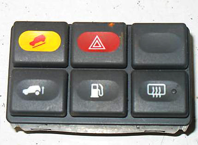
Cars traditionally have very generic button clusters, like [0]. It is even very common to have dummy buttons in there. Combine that with today's cars where those buttons are hooked up to some MCU to send a CAN message instead of being hardwired to a function-specific cable in a giant loom, and it is suddenly quite easy to change button functionality quite late in the design process for basically zero cost: you just need a slightly different label print and a small firmware patch!
Or, if you want to be 100% flexible, go with the ATM approach where physical buttons are placed next to an icon shown on a screen[1]. All of the flexibility and all of the tactile feedback! You can even go for a multi-level layout, with a top row of mode selection buttons, a bottom row of mode-specific function buttons, and perhaps even a big fat dial with haptic feedback[2]. Or even go all-out Elgato Stream Deck[3].
And sure, the fact that slapping in a giant touchscreen lets them decouple UX design from physical controls is going to play a big role. But it is by far the laziest and least user-friendly way of doing so. If that's the best you can come up with, you probably shouldn't be doing UX design at all.
[0]: https://www.classiccarstodayonline.com/wp-content/uploads/20...
[1]: https://media.istockphoto.com/id/672002868/vector/atm-machin...
[2]: https://www.youtube.com/watch?v=ip641WmY4pA
[3]: https://1.img-dpreview.com/files/p/E~TS940x788~articles/8521...
> He also explained that "I'm a big believer in screens, because I really believe if you want to connect, you have to make the magic work behind the screen." '
I'd say he doesn't drive himself.
Likely.
What does this sentence even mean? "if you want to connect, you have to make the magic work behind the screen". It crashes my parser. Good thing I am not reading hacker news while driving :-)
I read it as finding a happy medium between analog and digital i.e. people will love the big screen if they still have physical buttons for all the functions they use often while driving. If you force them to fiddle around with touch screen for everything, they'll hate the big screen alltogether because the experience frustrates them.
And at the same time the car companies want to move away from Apple CarPlay, which for any of its fault is a substantially better UI than we can expect the legacy carmakers to produce.
That’s all about money… they don’t want Apple to sell services to their customers when they believe it’s “their” territory.
Carmakers want SaaS revenue as well now.
They just want to sell their navi map updates like they used to before CarPlay was a thing.
I used to drive a range rover sport that would display a long pop up with some legalese about focusing on the road while driving when I hit the navi button. It required acknowledging.
That wouldn't be a problem if it weren't that the built-in MB navigator is by ar the best I've ever used, and definitely better than all of the apps (Google Maps, Apple Maps, Waze, Nokia Maps, TomTom, Garmin, etc...).
The low fuel, low wiper fluid, and forward collision warnings sound like they were all implemented a little clumsily.
What do you think the best implementation would look like? Seems it would still have to strike a balance. It's dangerous to tell the driver they're low on fuel if we distract them. But it's also dangerous for a driver to run out of fuel on the highway if we didn't catch their attention.
Also guessing you’re relatively detail oriented and don’t run out of gas, per:
“I don't want my car to draw my attention to itself for anything less than a critical engine/tyre pressure failures.”
The general public though… uh oh!
> What do you think the best implementation would look like? Seems it would still have to strike a balance.
Somehow a small amber light (in the shape of a fuel pump) and a chime has worked for decades and there haven't been hordes of drivers stranded as a result. Something your grandmother could easily understand.
10-15 year old cars maybe give an additional small information message in the cluster easily dismissible with a steering wheel button.
No, the problem has been the mass importation of tech industry rejects into the car companies, as if the car companies haven't been quietly and successfully writing embedded software for 50 years, who brought their terrible habits with them. Like a need to "reinvent" UIs every six months.
Cars are safety-critical machines. They are not a place for "creatives" to experiment with UI design.
Sadly marketing drones think everybody wants a Tesla-style "everything is a screen" design whereas a 1999 Toyota pretty much had it right.
This isn't difficult. It requires no "innovation". Analog tach and speedo with idiot lights for critical alerts (there is literally an ISO standard for this) should be mandated by law. Substitute tach for a battery monitor in an EV.
EVs are the worst of both extremes. Either the entire interior is a touchscreen or you have something like the Slate, where there isn't even a radio. A room full of geniuses and what they come up with is a bluetooth speaker holder. Unbelievable, you can't throw in a DIN radio like a 1987 Datsun? Why can't EV manufacturers build a "normal" car?
> Sadly marketing drones think everybody wants a Tesla-style "everything is a screen" design whereas a 1999 Toyota pretty much had it right.
they also had to redesign the door handle and people have gotten stuck in the cars because of that and died. not just one isolated incident... more than one case of the car door not working because it's electrical only and the backup physical release mechanism is under a door panel you need to pop off and reach inside to pull after you just got into an accident and are physically disoriented.
What the fsck possessed manufacturers to come up with that stupid recessed door handle? I think I might actually hate that more than touch screen climate controls.
Chasing very tiny fuel (or battery) efficiency gains.
Airplanes have had fully manual flush door/hatch handles for decades, and a handful of cars have imitated them. The electric retracting handles are pure gimmick.
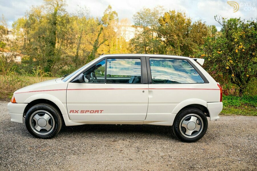
1990 Citroën AX Sport - https://assets.dyler.com/uploads/cars/406167/9080414/medium_...
Look at that door handle. Fully flush, NACA profile scoop in the bodywork to insert your finger behind the trailing edge of the door and flick the little lever up to unlatch it.
Give me that, please. I wish I'd never sold my 1991 Citroën AX GT, it was so quick and quiet. Hardly any wind noise, so it must have been very aerodynamic.
1969 Pontiac Grand Prix - maybe not actually aerodynamic, but it does have flush door handles:
https://upload.wikimedia.org/wikipedia/commons/e/ec/1969_Pon...