Windows 8 Desktop Environment for Linux
github.com175 points by edent 18 hours ago
175 points by edent 18 hours ago
The smooth, tile-based interface of Metro/Modern UI of Windows 8 and the Windows Phone are underrated in my opinion. It was simple, fast, and focused on touch. While I didn't have a touch-based Windows 8 laptop or tablet at the time, I had a Windows Phone, and I enjoyed using it more than any other device I've had since.
I unironically loved my Windows Phone, it was great to develop for too coming from a WPF background at the time
It was amazing. Ran circles around Android on weaker hardware, but because duopoly duo didn’t want to accept competitor it was artificially hamstrung and subsequently killed.
No, the death of Windows Phone was 95% the fault of MS/Nokia.
Pre-announcing that they were leaving all Winphone 7 customers behind for Winphone 8 meant that every retailer/distributor was left with unsellable stock (because they hadn't gained enough traction to sell out initial shipments).
If this was because Nokia made bad/cheap phones that were un-upgradeable or MS being arrogant isn't something I'm remembering anymore but the end-result was pissed retailers and nobody selling WP8.
The spec for wp8 was a lot higher than wp7. There was a bit change from WinCE kernel to WinNT kernel, etc. Without much confidence, I think wp8 was dual core or higher and wp7 was single core... and maybe there was a ram upgrade too.
All that said, WP8 did a lot better than WM10, where the WP8 phones were promised to be upgradable, and then the promise was walked back for low mem phones, and the experience was poor for qualifying phones anyway.
The final build of WM10 was actually ok on my Lumia 640; but that was way after everything was canceled and mobile Edge (this was the first non Chrome Edge) was still less usable than mobile IE, even though the renderer was better.
The really poor rollout of wm10, plus the tradition of forcing developers to make split builds to support multiple versions of windows phone/mobile made things pretty bad at the end. Calling the build for WM10 only 'universal' was icing on the cake. Android has all sorts of problems, but you can have a single APK that works on lots of versions, with some amount of new features get pushed to old OS with libraries and some new features have to be detected at runtime and use alternate flows. On the other hand, Microsoft kept making new features require using new foundation libraries that were unavailable on old phones. WinCE -> WP7 -> WP8 -> WP8.1 -> WM10 was too many step changes and developers bailed at each one. Meanwhile on the desktop, a 32-bit win32s application targeting windows 3.1 has a good chance of running on windows 11.
Also, they managed to make upgrade from wp8 to wm10 break installed apps sometimes. That wasn't great.
#notbitter
Retailers couldn't sell what the carriers didn't want on their networks. The carriers had momentum from consumer demand to keep selling iPhones. The carriers were given a lot of the "keys to the car" by Android and carriers were really happy with the ability to modify Android and/or micro-manage it, so they had a lot of incentive to focus on Android.
In the US, Windows Phone tried for the "iPhone experience", which made carriers unhappy and less likely to want to sell it, which ultimately left it the case in the US at a point where only one US carrier at a time was even "exclusively" selling the latest Windows Phone hardware, and only through its dedicated retailers. It took too long for Microsoft to also realize that part of the iPhone plan in the first place was direct to consumer sales and pressuring the phone carriers to provide SIMs rather than making "exclusive" hardware deals with carriers and hoping other carriers would try to compete for buying your hardware as well.
That was the final nail in the coffin. The reason why they didn't hit adoption in the first place is because Google prohibited their application on MS devices. Mobile YouTube already wasn't good enough, and without the rest of the GSuite (Maps, Gmail, Chrome, Calendar, Translate) it was dead in the water. And no, HERE maps and third-party clients were not good enough to tip the scale.
Google Mail and Calendar was fine; Google had an exchange connector at the time which worked well. (or well enough)
But maybe Google would have updated their WinCE apps to WP7 if Microsoft didn't make them throw all their work away.
Google had said they were killing the exchange connector and only changed their mind at the very end after Microsoft had written the workaround.
Same here. My Lumia 635 was one of my best purchases ever, it was so capable for the price. It's a shame that they stopped believing in it.
The Nokia Lumia 800 remains for me the best phone design I ever experienced. It was flashy, comfortable in hand and felt sturdy
I liked it too. But it never was great. E.g., I remember that the calculator had date computations, but the year input was a dropdown going from 1900 to 2100 or something like that.
Look at all 5 of us reminiscing here...
There are dozens of us. Loved the Lumia hardware, loved maybe not that lack of polish in places but the overall UI vision was mostly well executed. Its rigid experience across apps feels quaint now, but if we had this focus now, we wouldn’t be seeing the Light Phone, b/w UI hacks, etc pop up.
The Lumia Icon/930 I had was genuinely the best phone I have ever used, from both a hardware quality and software perspective. It made the competing iPhone 5 look like garbage.
the Nokia hardware was pretty great, too!
Nokia's hardware managed to prove to me, that plastic done RIGHT, is just as good if not more practical than the metals we have today. They looked fantastic, legitimately didn't require a case, and held up very well.
Some time after Apple discontinued the plastic Macbooks, I took mine in to get the battery replaced.
I remember overhearing one of the sales folk having to explain to a woman that they can't sell her the white ones, only metal ones as she preferred the chunky plastic.
And on most Lumias, if your phone got scratched, lost its shine, or you just got tired of the color, you could just walk to the store and get a new "shell".
Nokias hardware has always been pretty good. Heck, some of the nokia branded HMD stuff is well built for the price
I honestly think that the windows phone development experience is where Microsoft majorly shit the bed. The sheer volume of breaking changes (and the severity of those breaks) meant rewriting a non-trivial amount of your app from version to version. I know multiple developers that just dropped support for windows phone as a result.
Live tiles are nearly universally praised in retrospect, but it might be a case of hindsight bias [1]. The video [2] brings up some problems of the concept and why no other company copied the concept.
I think if Microsoft had made an easier bridge, faster from Win32 to things like Live Tiles (and the Charms, too) there would have been a lot more people praising the Live Tiles today (and maybe even the Charms). Live Tiles really made their case on Windows Phone 8 where nearly every app supported them (relatively well), that was the only "Notification Center" for missed notifications, and its glanceability became very obvious.
Charms are somewhat similar, too. On iPhone almost every app needs a Share button somewhere and almost every app still has it in a different place today. On Windows Phone 8 it was much more obvious why a dedicated OS-level Share button accessible just about anywhere in any app was pretty great. On Desktop it wasn't seen as helpful as almost no apps supported it (either as shareable things or as apps that could be shared to) because there was no easy Win32 bridge and Microsoft also didn't think to try to integrate with clipboard operations until too late in Windows 8.1 (and then never quite delivered it because most everyone had already written off the Charms by then), as what could have been a potentially easy path to use the existing Windows "share paradigm" to bootstrap.
(You can make cases for the other 4 Charms as well beyond the Share charm, but the Share charm is the most obvious where Windows Phone proved it was a good idea but the Desktop didn't have enough supporting apps to also prove it there.)
Are live tiles universally praised? I see them mentioned positively occasionally, but I suspect they are getting some benefit… like, they are the Windows 8 feature that isn’t immediately obnoxious. Windows 8’s UI just didn’t have any redeeming features, so the element that is merely bad gets brought up as a sort of “see I’m not a relentlessly negative hater, I’m objective” thing, I bet. Is there a name for this trope?
I'm sure there was some meeting where at the end of the pitch deck was some one said:
"...and after people acclimate to them, we'll put ads there! Advertising Directly in the UI!"
The problem MS created was WP7 was a technical dead end: a feature phone OS with a Silverlight UI, which was almost impossible to bypass, hurting third party support a lot.
WP8 was a far "better" OS, but it came with higher system requirements more comparable with Android.
Google never got enough crap on for their stunts with youtube in that era though.
Not to mention that WP7 customers couldn't upgrade to WP8, meant that both customers and resellers had devices they couldn't do shit with.
It's hard to fault Microsoft for doing what they did with WP7, though. They needed to make a statement that they were still committed to phones since WinCE was truly dead. So they made an MVP "Preview" of what the next Phone OS would be.
WP7 was sold to me in more like that language of "this is a quick MVP on the way to the next phone". It was exciting at that time in that way, seeing it as the hail mary pass of "What if we replaced WinCE with all the things we learned from the Zune? How quickly can we do a version of that which will give the right impression and set us up for the next 'real' version?"
Unfortunately yes, it wasn't sold to everyone with that perspective. I think Microsoft may have counted on developer enthusiasm a bit more to get the word across.
Also to be fair, that was still the era where "everyone" bought the new iPhone at launch and iOS compatibility was seen as somewhat equally spotty that if you didn't have the latest hardware you didn't expect the next iOS version to run well and you'd expect to get left behind on apps. It was also the era where Android was often non-upgradeable between versions on hardware (because carriers wouldn't "certify it") and you generally assumed an Android device was version locked to whatever OS version you bought it with. Microsoft may have felt somewhat safe needing a hardware jump between WP7 and WP8 exactly because that was de facto the case with iPhone and directly the case with Android at the time.
The WTF-based^W Silverlight-based UI was also an issue. Nobody really _wanted_ it.
To be fair, Android UI framework in that era was also bad. But it appeared several years before Win Phone 7, so developers had to get good with it.
XAML had plenty of experienced developers years before WP7. Just most of them were in "enterprise" environments.
I had an extensive Silverlight and WPF background by that time, so I still don't quite know why so many developers seemed to have a problem with it. I also did a lot of "convert this screen from WPF to Silverlight" and "now convert it back to WPF" that at the time I also didn't see why so many people were complaining about updating XAML from WP7's Silverlight XAML to WP8's UWP XAML. XAML is XAML. XAML is just stupid, ugly XML. Most of the work is updating XML namespaces, which can be automated with XML tools. Assuming you've used a pattern like data-binding or "MVVM" you shouldn't have much business logic to change between XAML versions, was my opinion at the time. As an Enterprise developer having done a ton of that as company winds shifted and more apps needed to be Silverlight one month and others WPF, depending on shifting winds/moon phases and "we want to just HTTP deploy only now" and "how easy can you embed this in VB6 without going crazy".
> I had an extensive Silverlight and WPF background by that time, so I still don't quite know why so many developers seemed to have a problem with it.
Money on app stores is made by games. In addition to being rewritten in C# games in Silverlight had to wrap Silverlight primitives - there was no DirectX or GL ES equivalent API. There were even quite wacky workarounds for this on built in components (like render tiles to textures from some linked in C++, which are then used by Silverlight) but weren't great for anyone.
The result of this was WP7 was an island, and one which had no commercial proof of worth until it was too late. We would all be better off had WP been and stayed viable.
Relatedly, XAML shares enough low level primitives with DirectX [0] that the interop story was always meant to be smoother and it is something of a shame that it has never been particularly smooth.
It was a massive lost opportunity in UWP that DirectX never released proper, first-party WinRT components. It's still almost criminally weird that DirectX still prefers ancient COM to WinRT. I partly understand it from a backwards compatibility perspective of support old games for the longest amount of time to not just move DirectX entirely to WinRT components, but WinRT was built for forward compatibility from COM and there are and have been Windows APIs with both COM and WinRT projections.
Some of it just seems stubbornness that DirectX isn't directly usable from WinRT (and/or that "second party" projects like XNA were murdered). Certainly another thing to add to the list of why Windows Phone 7/8/10 all failed to have half the catalog of games that other systems had. (There was some DirectX in 8 and 10, but only for C++ apps. It should have played way more ball with WPF and in languages like C#.)
[0] Far more than it shares with Win32, which is partly why some die hard Win32 programmers have always disliked XAML.
Yeah I agree. It was a little weird without a touch screen, but at that point I was not navigating the start menu visually with a mouse anymore anyway.
Windows phone was great. I think I got it when Android was still growing up. I liked the focus and the speed for sure.
Microsoft's bread and butter is no longer OSes, I think, and it's unfortunately starting to show.
This. The “mobile-ization” of desktop interfaces is a bane on current computing. The metaphors of work between desktop and mobile devices are wildly different.
Obligatory car analogy: a mechanic working in his shop has a completely different set of tools available than if he was going into the field to fix a car.
I really think GNOME is good at making an interface that works well on both, so is KDE to some extent with kirigami
I dislike Gnome on a pure desktop or non-touch laptop, in part because of UI decisions I think are meant to work better on a touchscreen. It's really good on a touchscreen though aside from the horrid onscreen keyboard.
> The ... UI of Windows 8 and the Windows Phone... underrated in my opinion. It was ... focused on touch.
That's why it was rated low. Most people were using this interface on PC's and laptops, without a touchscreen, where a touch-focused interface does not make sense. Maybe it was good choice for Windows Phone or Windows Tablet, but people were not rating it based on that experience. The very idea of using a single UI for both a touchscreen-oriented and no-touchscreen, kbd-and-mouse computers is the most problematic aspect of it.
> It was simple
No, it wasn't simple. There was the simple part, but things not integrated into the simple part were a hodge-podge of previous Windows versions' UI. Now, I like some of the previous Windows versions' UI, but putting a simple veneer on something does not make it simple; if anything, a little more complex.
> It was fast
The fact that an OS UI in the 2010s or 2020s need to be commended for being fast is kind of sad. Plus - I don't believe it was that fast. Did you try running it on, say, a 15yro machine relative to the Win8 launch time? i.e. 1998? Even with a 10yro machine I believe it was kind of sluggish.
I had an Android phone and my friend had a Windows Phone. I wanted to get a Windows phone but by the time I came around to needing a new device it was already killed off. Too bad.
Boy I could not stand Windows 8. Unfortunately, many of their techniques were copied into Linux distribution views and it made my life worse. The new start menu was perhaps the worst.
It created this massive doorway effect where I'd hit Start and the whole screen would whiz and spin and then there'd be all these moving tiles and I'll forget what I hit Start for. Frequently I'd then hit Esc, remember, and Start again. This was compounded by the fact that if you started typing after hitting start it wouldn't just filter to the applications. God knows what it would actually do but not that.
I was one of the people who enjoyed Windows Vista (which introduced sudo to Windows users) and Windows 7 and even Windows 10 after which the i7-4790k machine I had to do the Windows was no longer eligible for Windows 11 so I have no idea what that looks like.
0: https://en.wikipedia.org/wiki/Event_perception#Relation_to_e...
Talking about the design, the further we get from 2012, the more obvious it becomes that windows 8 was kinda like the bauhaus movement for an operating system that wanted to be on touch screens but was made to work on traditional mouse-keyboard interface. It was technically correct, aesthetically pure but socially rejected because it was too stark for the general public (my opinion).
This implementation gets one thing most Metro clones miss, i.e the typography as structure paradigm. In Win8, there were no divider lines or heavy drop shadows to denote hierarchy. The hierarchy was defined strictly by the weight and size of the font.
We spent the last decade drifting back into glassmorphism and mica materials (win11) because people missed the comfort of texture but from a pure information density and rendering performance perspective - the flat, monochromatic 2D plane of windows 8 is a nice tangent. It removed the cognitive load of decoding the UI chrome for touch users.
ps: I'm impressed by the constraint of using native Qt/C++ here instead of taking the easy route with electron or QML/javascript bindings for everything.
The cognitive load it's trying to guess where the button lies in the interface for flat screens. Not an issue under GTK2/3/4 with Zukitre (and QT5/6 reusing it with qt5ct/qt6ct or with an environment variable setting QT_STYLE_OVERRIDE to "gtk2" or similar.
I didn't remember having issues finding buttons on windows 8.
While they were certainly flat, they were always clearly signaled from my memory - did other people have this issue?
To be clear, when it was released I was one of the people hating on it, but it grew on me over time - and after I installed startisback, which essentially just scaled down the start screen/Metro ui to a slightly larger start menu ... It was a decent UX again, to me.
I remember running into issues with link-style clickable text in some parts of the UI that was almost unidentifiable as clickable because it stood alone with no similar text in non-link style nearby for reference.
There were other issues that I clearly remember. There was some remarkable jank when moving the mouse cursor across screen borders in a multi-monitor setup. If you were moving towards the edge of the current screen, Windows would under certain circumstances trap the cursor there instead of moving it across the border. I believe this was done to give "hot corners" a bigger mouse target, but that feature was almost completely DoA on desktop.
As much as the UI was fluid, smooth and probably best for a touch interface, I distinctly remember I hated it and frantically wanted my Start button back on my PC. It is kinda funny reading all the comments about its nostalgia, when all I could think was how annoying it was. I guess to each their own :-).
I always use the Windows key instead of pressing the start menu button, so I didn't really care. I always thought it made more sense as a Tablet / Touch OS, and for people without a touch screen, Windows 8 was just terrible. It had good intentions, poorly executed.
Apple did not even bother with touch screen laptops on the other hand.
My favorite goof of Windows 8 was the most googled question: "how do I turn it off?"
It required stupid mouse witchcraft and incantations to shut off if you weren't in a touch screen.
Windows 8 was Microsoft thinking everyone was going to use touch screens for EVERYTHING and ruining the non-touch screen experience for most.
I think around that time was when Ubuntu switched from Gnome to Unity as well. What a mess that was. Seemed like all the UI teams had lost their minds at once.
Indeed, this is the dirty secret and shame of our industry that doesn't get acknowledged enough. We are so prone to group-think and follow-the-thought-leaders that as my parents would have said, "would you follow them off a cliff?" the answer as an industry is a clear "yes." We rarely seem to learn from the lessons of the past either.
Gnome 3 was also doing a major restructure, which forced MATE to be built. I liked some things about Gnome 3's original release, but I was insanely annoyed because a lot of it went away, I'm not sure if it was just distro specific or packages changed drastically, I don't even know how to describe the feature, but for example Gnome 3 had apps that could show / hide on the edges of your screen, so if you were logged in to MSN (or even XMPP) you could chat with someone, then it would 'hide' it was really cool how that was implemented, I was upset to never see it again on any other OS, it felt like a nice way to keep a chat window available but still out of the way.
It has felt quite good to be a KDE long-timer watching all this unfold.
I’m sorry, but the release of Plasma, around the same time IIRC, was not without controversy.
KDE 4.0 - which introduced plasma - was released in 2006, and it was awful and wasn't supposed to be generally available (blame the distros and/or poor version naming). By version 4.5 (2010), KDE had stabilized. By the time Gnome 3 and Windows 8 were released in 2011/2012 respectively, KDE plasma was pleasant to use and rock-solid
It felt great to watch Gnome stumble after all the shit-talking, some schadenfreude was in order. I didn't care much for Windows 8; Vista was a the bigger mess of a release.
But, come on, a WHOLE OTHER LEVEL of "controversy."
Plasma criticism was pointed and deliberate and grownup. Windows 8, less so.
People don't like when I say this, but it's just another piece of evidence that mobile phones ruined everything.
IIRC the true story behind that dark period is that Microsoft was making vague murmurings about suing everyone for cloning Windows XP, so everyone felt they had to run away from that.
The problem was that it was a bunch of people who had no good ideas and no insight trying to come up with new paradigms for interaction, and they were all bad. What the Linuxen desktops were doing was even worse than Win8, and the ones on that journey were all determined for some reason to deprecate the old WinXP clone UIs at the same time. Gnome really moved into a position of harassing and mocking its old users (basically regulation redhat behavior.)
I also use the Windows key, but even then the WHOLE screen animating and changing to a different solid color was super jarring and tiring IMO. I much prefer a small popup like they have now
There's also the issue of distance for a mouse cursor to travel to select something. I think the general issue is imposing one interface for every mode of input instead of options, so either select an appropriate interface depending on how the start menu was invoked (even if it's just scaling it down to a confined space) or letting people select the default however it's invoked. Yes that's going to be more work, but when we're talking about the largest corporations on the planet I struggle to believe they can't afford it.
The Windows 8 start menu is no different from Launchpad on macOS throwing up a grid of icons that takes over the screen. Except macOS doesn't have the benefit of live tiles to excuse it.
> Apple did not even bother with touch screen laptops on the other hand.
> Windows 8 was Microsoft thinking everyone was going to use touch screens for EVERYTHING and ruining the non-touch screen experience for most.
Did/Does anyone actually use the touch screen on a laptop? Surfaces still ship with a touchscreen, so I assume they've done their market research.... It just seems like the trackpad/keyboard are the better ways to interface with your laptop, especially when it's already built in and not BT accessories or something. I hate to sound like an Apple fanboy but I'd assume the thought process was something along the lines of "Customers want touch screens on phones and tablets, not laptops"
My laptop fills the role of "Desktop computer on the go" and I want it to emulate that as close as possible, aside from form factor. Maybe I'm in the minority there? Others do use a laptop as a primary 'daily driver' and want the touch screen?
I don’t want a touchscreen laptop, but I do want a laptop that can convert to a tablet. Not to use as a tablet, but because then I can plug in a proper keyboard and just use the laptop as a monitor. If they sold non-touchscreen convertibles I’d go for that, but realistically that’s an impossible niche.
Yes, and this is a huge habit difference between Mac and Windows laptop users I know. Give a Windows user a Mac and they will habitually try to use scrollbars with their fingers. Mac users just don’t have that habit and they find it strange. The reflective MacBook screens also look awful with the slightest smudge so that enforces the “don’t touch” reflex for them, I think.
I do use one that converts to a tablet and has a stylus. But I have to do a lot of serious drawing for a living. I also appreciate coming close to book note taking without having to print stuff.
It really depends on what you do.
See, this use case has actually never occurred to me. Appreciate your 2 cents
Yes, quite a bit. Not so much as a replacement for trackpad/keyboard/mouse, but mostly to write down notes with a stylus, or do some quick sketches. I don't do that often enough to justify carrying another device like a tablet, but regularly enough to feel limited by the absence of touchscreens.
I don't, but my kids definitely do. I think this is a generational gap largely due to "what you grew up on." A laptop having a touch screen is near the top of the list of very-nice-to-have or even must-have features for my kids
I have a Surface Laptop Studio. And while Windows 11 overall kinda sucks, the ability to turn it into a little easel and the responsiveness of the pen are both great. I also like precise scrolling with the touchscreen sometimes.
The part of the hardware I really don't like is that the `Fn` key toggles fn-lock with a tap and then alt + F4 and such don't work. There's enough space to have another row of keys or something, I never want fn-lock off (I use four finger scroll for volume controls), it's infuriating. But pretty much all laptops (and shockingly some desktop keyboards) have similarly dumb behavior.
I can't imagine my working life without a touchscreen. Drag to scroll, touch to focus, pinch to zoom, just the usual stuff. I also use business style light laptops, so touch is always there and more usable/precise than the touchpad. People always get confused when they ask me for help on their machines and I reach to the screen for... nothing, usually.
You must get a nice arm workout moving your hands from the keyboard to the screen and back all the time. Sounds super slow though.
You're probably joking but I actually enjoyed switching between using the mouse and the touch screen, it's a cute little distraction.
> People always get confused when they ask me for help on their machines and I reach to the screen
Nooooo, please don't touch my screen! I can't stand fingerprints on my laptop display! Pretty much every gesture you mentioned has a touch pad equivalent that works just as well or better for a desktop OS.
> Drag to scroll, touch to focus, pinch to zoom, just the usual stuff
I feel like trackpads do most of the above better than a touchscreen? Mac trackpads, at any rate (I do recall a lot of PC trackpads and/or drivers being hot garbage)
I had a Windows tablet at the time, and actually paid for a Windows 8 upgrade. It was a nice OS on that device!
simply pressing ALT+F4 didn't do it? (of course you had to click the desktop first)
That still worked yes! But I don't think most people knew about this. You just gave me flashbacks to those days working at the local college, we would do this to restart all the machines in a classroom, we had them all on Deepfreeze so it would purge anything students downloaded / installed. We had other remote ways of doing it, but it was fun doing the shortcut too from time to time.
It did. To some extent it seems like it was a telemetry mistake that some of the easier mouse controls (an actual button for start rather than gesture; a missing obvious power button; not having a simple mouse button to get to the Charms; etc). Windows users opted into Windows telemetry all must have seemed to be keyboard-heavy (probably because only certain types of power users, such as myself, were opting in to telemetry). All of the keyboard shortcuts still worked. Some new keyboard shortcuts were added. Windows 8 was extremely useful from a keyboard shortcut viewpoint. (The Charms made a lot more sense from the keyboard.)
On "regular computers" I think it was flawed in two fatal ways:
- there was already an extremely heavy expectation that clicking the start button or pressing the windows key would bring up a menu, not a full screen takeover where all contextual sense of place (that you had in the past experience) was lost.
- the UI being a full-screen takeover on a phone (Windows Phone) or a tablet (10"-ish tops at the time) was OK but on a 21~27" desktop it's absurdly overwhelming.
Especially with such a low information density. It was clearly just a massive amount of wasted screen space on desktop.
If you had good Live Tiles there was a ton of information density. You could have the weather, your calendar, recent emails, recent tweets, recent photos, interesting news, etc all on one at-a-glance screen (versus the phone form factor where you'd need at least some scrolling).
It felt like wasted space on the desktop because it was originally hard for desktop apps to opt-in to Live Tiles and send Live Tile updates and not enough people were using the sorts of multi-platform apps that had great Live Tiles.
The start screen is something you just had to get used to. I think it's more comfortable than the menu. Effectively it works as a second desktop to put application shortcuts on. I have about 30-40 on mine (on Windows 10, mind you), which is way more than would fit on a menu without submenus.
I too hated original metro on desktop back in the day and especially missed the start menu, but I also look back on it fondly.
I think that Microsoft was ahead of its time and that they had a better design language than any competitor and original metro still holds up favorably to contemporary designs.
Last time I sat down with a windows 11 pc I even thought “wouldn’t it be better if the start menu was just full screen?”
Tbf the mobile OS with a similar design language was the best mobile UI I ever had the pleasure of using. Last time I felt impressed by Microsoft but alas.
Me too! Metro design was, I don't know, a whole different league compared to Apple or the Androids of that time. I'm not sad that MS failed on that front, but damn, that was a good mobile phone UI.
It did a few things right relative to Vista but it was also bad in many different ways, including but not limited to the (double) Control Panel
So it was a bit of a love/hate relationship.
Windows 2K is still the best ever made by Microsoft. I wish they'd just stay on that design and make incremental improvements to keep it fresh and modern.
I really liked Vista. It's problem aside, that were fixed in future Service Packs it felt like a new OS.
My first experience with it was I couldn't figure out how to shut down my pc (the stupid side charm bar) on Beta 1 of Windows 8.
It was last seen perhaps in the Windows 11 Beta 1 release, confined within the start menu and I think this is where it peaked. It was removed shortly after to the yuck we have now, perhaps slightly coming back in 25H2 with the New Windows 11 start menu experience app groups (I have not personally used it)
>It is kinda funny reading all the comments about its nostalgia, when all I could think was how annoying it was.
Agreed and it happens with almost every sunsetted version of Windows. At the time of XP, it was how great W98SE was, and in 7, XP was so amazing, etc., etc. I think the "every other version" meme has only recently been killed by MS because it has been so long from 8.1 to 10 to 11. But even when 11 is sunsetted, there will surely be articles about how amazing 11 was and how much they dislike 12.
First thing I did after installing upgrading to Windows 8 was installing Startisback and I forgot I was even running it. I'm not exaggerating, one time a friend sitting by asked if I was it was Windows 8 and I had to think for a moment.
Windows 8.1 combined with StartIsBack was a much better OS than Windows 10 I was actually surprised when everyone praised that ad pushing piece of crap with mandatory spyware, forced updates and inconsistent UI all over the place.
Yeah I don't remember anyone liking Windows 8 at the time. I'm honestly a little bit surprised to hear that there is nostalgia for it at all.
I remember that as well, and in the enterprise they added one of those start menu plugins. But boy, compared to a react based startmenu in 2025...
What I find slightly amusing is that my Chromebook used to have a center-aligned task menu. Now Windows has a center-aligned task menu and Chrome OS...aligned it left!
Click Start to end your session.
I think 8.1 and later fixed a lot of this, but in 8, even if you were on a 100% "desktop" device using mouse and keyboard, whenever you'd "close" an app, it would take to the huge start screen instead of your desktop, and you'd have to find the "desktop" button to get back to that.
This is some of what I wrote in July 2013 as suggestions for how Windows 8 should change behavior when mouse and keyboard is present:
• By default, boot to the desktop. (This is a new individually available option in Windows 8.1.)
• By default, return to previous applications. Similar to Windows Phone and Windows 7, when you close an application, you should return to where you were before. If you are in any kind of desktop experience when launching an application, whether it's for the desktop or in the Modern interface, you should return to that desktop environment upon closing the application.
• By default, open media files and documents in desktop applications. Fortunately, when you select these as your defaults, you are properly returned to the desktop when you close the application. Unfortunately, any Modern applications return you to the Start Screen when you close them.
• By default, if there is no touch screen, disable hot corners and edges. Provide an option to enable them within your mouse-driven experience.
• By default, if there is no touch screen, provide a classic Start Menu in addition to the Start Screen. Mice are well-suited to smaller menus that pop out and allow you to remain largely in the desktop experience while you select new files and applications to open. Provide an option to disable the Start Menu and jump to the Start Screen if desired.
• Upon first run and selection of the mouse-driven experience, run a video demonstration introducing users to the Modern interface, Start Screen, hot corners, gestures, charms, Windows Store and Modern applications, focused on how to access these items with a mouse and keyboard.
• By default, provide a Search experience tailored to the desktop environment.
"Most of the above options already exist in Windows 8, but it takes some information, time and effort for users to change the settings and get the experience you expect when using a system without a touch screen, largely driven by mouse control. It is in these conditions that users are frustrated by Windows 8, as they find themselves faced with interfaces that are much friendlier to touch screens, and are unexpectedly removed from the desktop experience and placed into the Modern interface and Start Screen, disrupting their workflow and adding extra steps to return to the windows, applications and tasks they were working in. An overall one-click default upon first usage of Windows would allow users to select the mouse-driven experience they prefer on systems that are not primarily driven by touch."
"look, they ported the worst part of Windows' history to Linux"
Regardless of whether or not this was done for fun or due to actually missing Windows 8(as the author does), it's impressive.
I remember reading some time ago that the windows 8 UI lead got fired but I can't find proof of that now. Maybe it was just satire lol
Can't wait for the 'Show HN: MacOS Tahoe Desktop Environment for Linux' post
The only thing worth saving from windows8-10 is the windows border. it is a huge usability win. Clear borders. square (so it's also fast). clear colors showing which window has focus. It's also funny this show up now a day after the top post was the osx windows border radius fiasco.
yet no linux WM has a decent windows8-10 window border clone.
KDE used to but since the rewrite of the theme from kde5+ they not only killed it, but also removed the option to have sane window border color to show focus. Now it's "accent color" which should be non contrast because they will force that same color on toolbars and such, just like all the bad ideas from office-ribbon era.
well there is the default style for openbsd's fvwm. clear borders, grab handles, contrasting fg/bg colors. But I won't go so far as to say it is decent.
https://debugpointnews.com/wp-content/uploads/2023/04/OpenBS...
Anyhow it's bold to claim that there are no linux window managers to rival win8, linux is like the paleozoic of desktop interfaces. It has the opposite problem there are too many of the infernal things.
I am currently running a utility to square off the window borders in Windows 11.
on KDE5-6, ironically, to have high-contrast windows and square borders, one must use something written because the author wanted round corners on older versions of kde :)
Given the complexities which anything but square corners adds to screen grabs, I've never understood why anyone would want to use such.
Funny how almost everybody hated the Windows 8 desktop environment. And to this day, Windows 8 is still seen as one of the worst versions of Windows for that reason, even if it was pretty decent under the hood.
Projects like this show that it has its fans. It feels like authors being successful only after their death. I still think of the Windows 8 UI as terrible overall, but now that the hate has passed, people are not afraid to give it some redeeming qualities.
It was pretty good on mobile though, which is the root of the problem I think. They tried to unify what shouldn't be unified.
This is missing the best part of windows 8/metro - the glow around the cursor. I found it really fun playing with how the glow highlighted smooth sections of tile borders as well as illuminating the whole tile. IIRC it also affected window borders, etc. Very fun to play with.
If you want to read some confessions from the guy who is responsible for Windows 8 (Steven Sinofsky) read this blog post: https://hardcoresoftware.learningbyshipping.com/p/108-epilog...
Whole blog is about his time at Microsoft but this particular post mentions windows 8
Apple guy here who actually liked Metro.
Party of one, for sure, LOL
Glad to see an attempt to revive it on Linux
Is there a Windows 98 SP2 Env for Linux? The peak of personal (non-sysadmin) computing experience. There were fewer BSOD than Windows 95, and all DOS games still worked unlike Windows 2000/XP where most DOS games worked.
My fond memory is of XP (with the child's toy color scheme changed to the Win2000 one) or simply Win2000 - it actually had preemptive multitasking and protected memory, unlike 95/89.
Everything you need, nothing you don't. The OS/DE stayed in its lane.
The only thing I miss about Windows 8.1 is when I hovered my mouse over an application in my taskbar, it showed a little tab preview of what it's doing.
I certainly don't miss that desktop environment, though.
Oh boy. No one wanted this on Windows back when it was released. I’m sure it’ll be a hit with Linux users everywhere.
This could be very nice if it preserves/implements the tablet features.
So nice to see this. I really loved Windows Phone for the simple UI it had which shared a lot of concepts with this. And I felt like Microsoft could have made something really great from the Win8 UI if they had iterated a few more times before dropping it.
I hope you take on that initiative and make the improvements that they didn't
I use a Windows Metro inspired launcher on Android and it's the best phone UI experience I've ever had: https://play.google.com/store/apps/details?id=com.nfwebdev.l...
I was asking for something like this but for windows 7 sometime ago. A little bit surprised that someone made something so strikingly similar to what I requested.
I hope that somebody creates something like this for windows 7 as well. One can only hope as Windows 7 nostalgia hits hard
+1 for a Windows 7 clone. I have not seen a theme that comes close to copying Win7.
Windows 7 it's easy. Plastik was like that before Windows 7 itself. Just set that theme under Plasma 6 and you are done. Also, QTCurve.
One can argue that Windows 8 is easy as well but here we are (https://github.com/kavinunethsara/tiledscreen)
Sure one can try to patch our way and this is what people suggest but if we are already having windows 8, Please lets just have windows 7 as well, there is no harm in it.
I hope that the author of the project or its community about the win 8 DE could look at resurrecting/creating win 7 DE ootb as well.
I want this for everything, including my phone, tablet, and tele!
I which distro this is being tested on.
The design looks cool, but it surfaces the app launchers as the protagonists of my workflow. I feel that it would be better if it was more about open windows or something in this direction.
Is it just me or does anyone else notice all the little inconsistencies on these "windows ui clones" that show up on linux? I like the idea but looking at the pictures I can't get past the lock screen (font size feels wrong, the borders missing on the input field, the size.. it just all feels wrong somehow I can't explain. That On-Screen-Keyboard squeezed into a tiny square??). On the "start menu" picture the two font sizes near the battery icon, how all the linux apps on display have weird coloring and blues-that-dont-quite-match, the bright greens with white text, etc..
Not to diss the UI attempt at all, I just always seem to spot all these little things/polish every time one of these come up (I've seen so many XP clones where the minimize/maximize/close buttons look out of place and badly shaped, etc..). I genuinely wonder if it's because I spent so much time on these OSes back in the day or if all the DEs being used have some inherent limitations that cause these design inconsistencies.
You need tons of effort, plenty of experience in the field and a single unified direction to get them done well, and unfortunately the Linus Torvalds of Design currently does not exist.
Many underestimate just how much is behind everyday basic UIs.
Even the biggest native Linux desktop projects suffer from this. KDE is typical death by a thousand papercuts, GNOME tried but their amateurism is clearly visible.
I think these things tend to be somebody’s fun little mini project, so polish is not a high priority. Realistically a big community of contributors isn’t going to grow around cloning a UI that Linux users intentionally left behind.
The beautiful thing about Free software is that people can do whatever they want! In a way is is quite impressive that somebody can get into the uncanny valley with this sort of project, right?
It's because it's a tremendous amount of time and work and effort and QA to get UIs to look really really well-designed. (Even then, the design can still suck, like modern Windows or appleOS 26.x.)
I don't think people realize just what an insane amount of labor it is to get these things implemented, even if you're handed a perfect design spec up front.
Maybe LLMs will close this gap once they get better at seeing things.
First thought that popped into my mind is the quote from Bennett Foddy for his game Getting Over It.
--"I made a game for a certain kind of person. To hurt them."
It probably works better than windows 8 ever has... Seeing it might have something called "common sense" over "org driven design".
I doubt it actually works better. In my experience hobby FOSS is exceptional at building tools and servers, but abysmal at building GUIs and anything that requires some semblance of non-tech-user UX.
win8 is the latest version of windows I've used (for about a week before I installed linux, ironically enough. I'm using that laptop right now lol) and I do not remember it being a good experience. Why you would recreate it is beyond me but I think it's neat that folks are doing stuff like this.
Now, if someone wants to recreate win95, I might be interested
> Now, if someone wants to recreate win95
You can try Chicago95 [1], but it's only a XFCE theme. If you want more than a theme, there's SerenityOS [2] but it isn't suitable for daily use (yet)
[1] https://github.com/grassmunk/Chicago95 [2] https://github.com/SerenityOS/serenity
I'd like a DE/theme that aims to do what the Win2k shell did. File explorer, basic window management, app switching, app launching. Back before every single UI widget had to integrate 47 types of OS feature-of-this-year's-product-cycle functionality.
Chicago95 isn't far off looks-wise. Something slightly more polished than Xfce, but way less than the behemoth that KDE is. I really feel like the modern basic desktop UI was pretty close to complete in 2002-2005, and the moment we tried to make your contacts list available for use in every single application we fell onto a slippery slope from which we have never recovered.
Oh helllllllll no. I’ll stick with my Linux. Cool project but Windows is just crap nowadays, even the UI. Best was XP.
No one ever uses/used our windows 8 laptop because it was so horrible. Total waste of money.
As a gnome user I remember thinking I could probably get used to the start screen.
If it doesn't come with a XAML WinRT based framework stack, it is only half way there.
It feels like no one in this thread has actually clicked the link or watched the video demo. Do you people only read titles? Purely from a conceptual point of view, sure, it's a cool project, but the actual UI and UX are abysmal compared to what Windows 8 was. Take one look at the lock screen.
Not to crap on the dev, but ignoring it is also counter-productive: it feels a bit like seeing one of those iPhone 4 clones that ran on J2ME trying to parody iOS - impressive attempt at making a dumb phone look less like a dumb phone, but it was miserable to use or even look at. I see this all the time around Linux UIs, no one has standards and no one wants to point the lack of them out.
You read the title and go to discuss about it in the comments.
No one has time to follow the links and watch something there.
The best UX ui was in Windows XP.
This would be nice for a Linux phone.
Nice to see it uses Qt C++ and QML (:
No, not nice. It should use TypeScript or Rust. C++/QML is unsafe.
TypeScript is way, way too slow to use for desktop applications. People try and, surprise surprise, those applications are slow as shit.
Qt has a C++ backend, so C++ is used. Qt is relatively safe and well designed.
TypeScript transpile to Javascript - do you really want your operating system's shell written in slow ass Javascript? Modern C++ with hardening rules for the compiler[1] is pretty safe.
[1] https://best.openssf.org/Compiler-Hardening-Guides/Compiler-...
Win 8 UI was way ahead of its time.
I still prefer the time of Win 2K (or max Win 7)
Windows 2000 was peak usability. Windows XP was also good, especially with the Classic or Standard themes.
Windows 8's UI was not new by any means. Shareware with that style already existed in early 2000's.
Nice. I'm an open source guy, but being disappointed with Android's openness (years ago) I got a Nokia Lumia 800 with Windows 10 Mobile (or whatever it was called). Loved that OS. Fast, well integrated. Can't help but keep thinking it would have gone somewhere if they'd kept at it (in the form of Android app compatibility or "the defacto MS365 OS" or something).
Then they'd call it Copilot OS in 2026 and mess it up anyway. So perhaps it's good that it died ;)
There was nothing wrong with the Windows 2000 UI except that it was “boring”. I get wanting to make things feel new, but doing so requires great skill to achieve without losing the functional imperatives, which is exactly what they did with pretty much every design since Win2k.
ugh I still have to administer old w2k12 Metro vms and I hate it
Oh god why
I guess nobody here reminiscing about Windows 8 will mention that the executive in charge of it was texting and emailing with Jeffrey Epstein.
I would be okay to use this DE on a mobile Linux but I'm afraid the usability on desktop is going to suffer like it did with Windows 8.
"Your scientists were so preoccupied with whether or not they could, they didn't stop to think if they should". /jk
Probably nice on a tablet.
Glad to see someone was inspired to do this! I believe the Windows 8 UI was good - one of my unpopular opinions explained below.
I never personally owned a Windows 8 computer, but I used some at work. I logged in to Windows Server 2012 and 2012 R2 on a daily bases for several years - these had the same type of start menu.
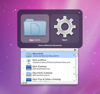
Prior to this experience on Windows, I was a Mac OS X "power user" enjoying Quicksilver[0][1] on Snow Leopard (10.6) through (Mavericks 10.9). It's mode of interaction[2] was very similar to Spotlight[3] built-in to modern macOS.
I also learned to touch type on that very same *MacBook while waiting for a plane in an airport terminal.
All this is to say that the concept of hitting a key and typing to launch an application felt very natural to me when I first encountered the Windows 8 UI. I never felt the need to use a traditional start menu, despite having clocked lots of hours on Windows 7, Server 2008 R2, and older versions. in the office. When Windows 10 brought back the traditional start menu, I only ever searched through it like I would have on a Windows 8 or MacOS system.
Recent benchmark testing[4] showed Windows 8.1 to be faster in many ways compared to Windows 10 and Windows 11. I was surprised someone actually did this, but not surprised at the results!
Perhaps one of the reasons why I preferred it more than Windows 10 and Winows 11 is the Control Panel was still very usable in Windows 8. As someone who worked on Server versions of Windows, the Control Panel was very much embedded in my muscle memory. The erosion of it in subsequent versions of Windows is the source of my growing pains. That, plus all of the popular reasons why Microsoft/Windows gets backlash today.
* The 2010 MacBook was advertized with a 10 hour battery life. Many years would pass before Apple would again advertize such a long battery lifetime. I had upgraded the RAM and swapped the optical drive for a second 2.5 hard disk, then re-installed Mac OS X in software RAID1 mode. It was extremely stable for many years until the day I decided to decomission it (ran 'sudo rm -rf /' at the Terminal). I.e., the type of stuff that would give Tim Cook indegestion.
[0] https://en.wikipedia.org/wiki/Quicksilver_(software)
[1] https://github.com/quicksilver/Quicksilver
[2] https://images.sftcdn.net/images/t_app-cover-s,f_auto/p/7e76...
[3] https://en.wikipedia.org/wiki/Spotlight_(Apple)
[4] https://meterpreter.org/the-20-year-showdown-why-windows-8-1...
Please permanently delete this repo forever.
I am having nightmares right now.