Myna: Monospace typeface designed for symbol-heavy programming languages
github.com395 points by birdculture 3 days ago
395 points by birdculture 3 days ago
Very nice and condensed. The same reason I switched to Iosevka (Joseph), recently:
https://github.com/be5invis/Iosevka
The fun thing with Iosevka is that one stands a reasonable chance of reading the source code (as opposed to just random numbers in SplineSets etc.)
Iosevka is a beautiful font indeed. the condensed look of Myna was inspired by Iosevka. i saw it once in a coding demo and decided to make it condensed. the predecessor of Myna (called Hera, available on my profile) was just a customised version of Source Code Pro (and is non-condensed, just like Source Code Pro).
I thought Myna looked weirdly familiar. I use Source Code Pro just about everywhere.
Beside being a neat font in its own right, Iosevka allows for custom builds with different settings, selection from a bunch glyph variants, and custom ligature choices. It's pretty incredible.
Iosevka is great. I use a custom version Iosevka Orw from here https://github.com/s0la/orw/tree/master/.fonts
It's about halfway between standard Iosevka and a typical monospace font in terms of narrowness. I find it ideal.
Thank you for the detail that Iosevka is a form of the name "Joseph." I've used this font for years and it never clicked for me--nor did the correct pronunciation, which it turns out was always listed on the readme.
You should check out Pragmasevka https://github.com/shytikov/pragmasevka
Switched from Iosevka to this, feels a little more readable.
My favorite monospaced font, on Windows and Mac.
I switched to codenewroman mono with a nerd font.
Makes my terminal look amazing as well.
Especially since I've been working on a color scripts compilation that relies heavily on font being accurate
Not trying to be negative, just confused: I don't really see how this font is "designed for symbol-heavy languages". The symbols look normal to me. Maybe the letters are a little more spaced? I'd love to be enlightened.
>Near-Perfect Alignment: multi-character symbols like ->, >>=, =~, :: align seamlessly
The GitHub page has a list with 5 items of what was the focus, this is the first (and I think the most easily noticeable) area
I wonder why only near-perfect.
there are bounds to be many many operators and glyph combinations where things don't match properly. an example is the variable declaration and initialisation symbol in Go which combines colon and equal sign. if you use Myna and come across any such examples, please raise a feature request. i only focused on glyphs for languages i use personally. but if there is interest i am open to adding contextual alternates to give some alignment in cases where changing one glyph would disturb other combinations. of course you can always point out any rendering or design issues with singular glyphs too.
designer here. by symbol-heavy languages i mean languages like Perl and Haskell which make heavy use of symbols (sigils in Perl and operators in Haskell). Myna was designed after my frustration with other monospace fonts combined with my (self-imposed) inability to use ligatures.
I think it might be useful to put some screenshots of other fonts on your page, to show what symbol or alignment problems yours corrects. Because I've studied a lot of typeface design, and I can't really figure out what you're doing, what pain points you're trying to address.
Because when you say "and $, @, % seem ever mismatched?", I don't have the slightest idea what you're talking about. I certainly am curious though, since you went to all the work of building a new typeface!
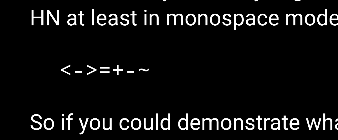
And when you talk about fixing alignment, like all of these seem correctly vertically aligned with each other here on HN at least in monospace mode:
<->=+-~
thanks for the suggestion. i'd think about adding screenshots of other fonts.
about the alignment, i think the README might give an impression that it's solely about vertical alignment, but it's more about uniform flow of characters along with some resemblance with an actual symbol (which we can not have in ASCII).
for example, take the `<-` combination. i think you're correctly pointing out that in most fonts they are indeed vertical-aligned properly. but there are other details (horizontal alignment, angle between strokes, weights, etc) which i found missing. in most monospace fonts, these less-than and more-than signs are not designed with the view that their most common usage is indeed not checking for inequality but for bitwise operators and struct pointer dereferencing (C), function declaration and monadic/applicative/functorial programming (Haskell), shell redirection (bash), function composition (OCaml, Elixir), tags (HTML), and countless others. if you think about it that way, it makes sense to not make the angle between strokes too small. many monospace fonts do it because they respect classical typographic conventions regarding space and design. the same goes for the designs for backquote, tilde, comma, colon. in most monospace fonts, backquote is so small it's barely visible and tilde looks too much like the hyphen, etc.
Myna is my attempt to break some of these conventions to make things look a little bit even for programmers.
I'd be curious to know if you had any numbers on the usages of inequalities versus bitwise and structural dereferencing operations.
I'd be very, very surprised if inequalities was used less often.
Don't get me wrong. I appreciate the work you put into the font and it looks very nice but that part of your post struck me
i meant programming in general, not just C.
the inequalities would probably be more common than bitwise/pointer usage in C, most because of for loops, i guess.
but if you consider all the other languages i listed, it is obviously not the case, especially in Haskell and even HTML.
They are definitely not aligned for me: https://i.postimg.cc/cHXyWhYT/Screenshot-2025-11-08-07-47-37...
Very curious what your browser+OS is, and what monospaced font it's using (if you have access to the web inspector).
A search on Google Fonts shows most monospaced fonts keep them vertically aligned, but there definitely are exceptions:
https://fonts.google.com/?preview.text=%3C-%3E%3D%2B-~&categ...
Iceraven (a fork of Firefox Android). Unfortunately mobile browsers don’t have devtools :(
Apl, BQN and Oiua would like to talk to you.
And some proof assistant languages and frameworks. For a second I was really excited there, but this is another font with “programming ligatures”.
i know the title can be a bit misleading but Myna is primarily ASCII.
languages which insist on using full Unicode like APL and Agda have bigger problems (availability of uniform glyphs and inconsistency with monospace design) on their plates. which imo is one reason why full Unicode editing hasn't really caught up.
Myna doesn't use any ligatures though. it would run on almost all terminals and editors.
Yeah, I realize that I was wrong about ligatures afterwards. The two plusses next to each other looked as if they are a single combined glyph, but they are in fact separate. I think this is the effect you were trying to reach, and it looks very slick.
What about a J example? https://code.jsoftware.com/wiki/NuVoc
J mostly looks good but [) looks almost like a fancy capital D which can be distracting and =# run together at smaller font sizes which is a little weird. Those are the only things that jump out at me but I did not look hard, overall I would say it is one of the better fonts I have tried for J.
The big problem that I am having with this font is that its narrowness makes it difficult to find a fallback font for APL/BQN that plays well.
good idea. since i don't code in J, can you supply a 2-3 line quintessential J example to demonstrate this?
Where does the design for the text characters come from? Is it based on a mono font you find readable?
Myna's predecessor was a customised version of Source Code Pro. but i've changed a lot of glyphs by borrowing designs and modifying glyphs. so, it may not look like it at all now.
My own font took on the blockyness of the IBM 3270 terminals. Now it has a ton of glyphs those terminals never had, but I tried to remain faithful to its original design principles.
Not everyone likes it, but I do.
i totally get what you mean.
i've not been faithful to the original design of Source Code Pro or even Fira Mono or Ubuntu Mono (from which i also derived a lot) but do try to stick to a simple geometrical ideal with only a few exceptions.
That's because the proper way to explain design differences is by showing them, and there is no comparison, so of course it's easy to get confused
Also see the JuliaMono typeface: https://juliamono.netlify.app
It was designed to be a comprehensive monocode typeface to support Julia's full Unicode support.
Thanks for the link, at first glance seems like a fascinatingly rich font (by the way, to overcome the char/font limit they can publish JuliaMono2 and 3 and 4 and then set those as fallback fonts to reach the full coverage...)
thanks for pointing it out. i mostly program in ASCII range. Myna covers a reasonable subset of Unicode but one can indeed use Julia as a fallback for Myna to cover Unicode if one wishes.
This is very pretty, but...
The kerning in the "Lorem" at the top drives me batty. It nearly looks like 2 words to my eye. I know that's super subjective and it probably doesn't bother anyone else at all. It's kind of a deal breaker for me, though.
i use this font basically everywhere and have become kinda blind to the defects. for me it looked best when glyphs are mostly centered (which makes them "genuinely monospace" if you catch my drift).
but you raise a valid point. it is not entirely subjective. some obviously grotesque (no pun) kerning would need to be changed in the next version. if you can point out some obvious ones i would urge you to create an issue.
Looks beautiful! Have you done any focus on Typescript by chance?
I will test it out and report any abnormalities I see!
thanks! in TypeScript, i've not noticed any glaring combination mismatches. i think most common combinations are covered by considering C and Perl. but feel free to try and report them if you find any.
This, like many fonts, fails to handle vertical arrows:
  |    ^
  v    |
The bottom of the independent caret should be lower, roughly symmetrical to the letter `v` (this is not traditionally a goal). The top should still reach the height of a capital letter, but the bottom should descend into the lowercase letter area - for many fonts, perhaps to the level of the horizontal part of a lowercase `e` (is there a typographical term for this?)? For fonts where the x-height is half of the cap-height, there might be no overlap with the lowercase letter, though it still doesn't need to worry about leaving space.
The bottom of the caret is, however, higher than the mathematical "and" sign ∧, which rests on the baseline (and usually does not reach full height) or the Greek capital lambda `Λ` which is full height.
> the way people actually have come to use it
I have never seen anyone use it as part of an up arrow spread across two lines in the way that you’re suggesting. So I don’t really understand your point.
Ok it’s not symmetrical, but I don’t buy your argument that it _should_ be (or that it’s a reasonable complaint to make about a font).
> I have never seen anyone use it as part of an up arrow spread across two lines in the way that you’re suggesting.
You've never heard of "caret and stick"?
Rust compiler error output certainly uses a lot of vertical arrows. But it also highlights the fact that the caret is often used to highlight characters on the line above, and if it were lower it would be worse at doing that.
I do hate this asymmetry when I'm trying to do an ASCII flowchart of some sort.
But I'd also like to add that calling it an unreasonable complaint sounds a little hysterical. It's just a complaint. It's also a clear one, and of obvious use.
Your point about the caret is interesting, but I'm a bit dubious about using them for vertical arrows. I don't think it would be practical to type this combination in one go, since the two symbols would be on two separate lines. For the upward arrow, are you suggesting caret-return-space-space-space-...-vertical bar?
Are there any programming languages that use vertical arrows? Do they appear on one line or two?
> Are there any programming languages that use vertical arrows? Do they appear on one line or two?
Befunge (1993; many later languages were inspired by it) uses just the ASCII arrowheads. The arrow tail is more likely to exist in doc comments.
APL
i don't think that qualifies. because the alignment issue is about multi-line alignment of upward arrows. APL usage is clearly meant to be covered by some single Unicode glyph.
Ah, yes, I see now. I can’t imagine using a programming language where I had to compose symbols vertically. I don’t know if any such infernal language exists, and I don’t understand why o11c thinks it matters.
I don't see such a niche use case as a design failure.
By your logic, the lowercase "v" should extend even higher to meet the pipe. The caret has conventionally been higher for a long time, and IMO would look out of place making it the inverse "v".
If you want arrows, just use U+2191 and U+2193.
Are you trying to get a ligature that crosses lines?
You could maybe try U+2303 (⌃) for the up arrowhead, but why not just use U+2191 (↑) for the standard arrow?
The crossbar height of lowercase letters is not a common typographical reference point...
I don't care about ligatures, just symmetry.
That's fine I guess. Some audiophiles don't care about music, just sound.
thanks for pointing it out. as i mention below in a comment, there are bound to be many combinations which don't align (especially vertical ones). i would ideally tell you to invoke a feature request but i am not sure this esoteric combination could even be detected in a contextual alternate rule (which Myna doesn't support anyways for now).
beside if i may say so in my defense, the comparison is a bit unfair as a V (a full letter) is being compared to a caret (almost a superscript symbol). i have broken many typographical conventions but it won't make sense to break programmatic convention of the caret operator just for the alignment of the vertical arrows.
> won't make sense to break programmatic convention of the caret operator
I don't know why the elevated position of the caret is sacred, other than to use as an accent mark. It could cause confusion with the ∧ (AND).
> Note that the raised appearance of `^` exists for compatibility with typewriters that use the backspace key to use it as a circumflex accent over lowercase letters. This is doubly obsolete today
The origins don’t really matter at this point. That’s what the character looks like and it’s what everyone expects.
Your use case is extremely niche. Making a font choice for that specific double-line situation would alienate everyone else who just wants the ^ to look like a ^.
Like others suggested, just use the Unicode arrows if you want arrows. Let the ^ be a classic ^.
It’s really disappointing when I find a new font that seems interesting until I encounter one weird design choice that makes it surprising to read. Fonts should be boring, typical, and follow what your brain expects to see, not trying to erase decades of typography norms and start something new for one common character.
> Fonts should be boring, typical, and follow what your brain expects to see
So you're ok with permanent confusion of 0 vs O because "boring/expected" doesn't add a dot for zero?
> erase decades of typography norms and
This is not (such) a (n absolute) thing, there are different contradictory norms that persist for decades, just like in and artistic (though not only) field, so at a practical level this offers no guidance for any specific decision, you'd have to actually consider it in that specific case to see whether it makes sense
> So you're ok with permanent confusion of 0 vs O because "boring/expected" doesn't add a dot for zero?
0 and O are not actually confusing in any of the fonts I use. As I’m typing this comment without any custom font changes, the 0 has a slash through it. In other fonts I use there’s an option to add a dot. These are all normal and common.
Redrawing the ^ character to not be elevated would be unexpected.
> This is not (such) a (n absolute) thing, there are different contradictory norms that persist for decades,
Fonts are expected to show common characters as those character, not something different to satisfy a singular edge case at the expense of every common use case.
If someone wants vertical arrows they should use Unicode vertical arrows, not try to force everyone looking for a ^ character to see something unusual.
> in any of the fonts I use
But we're not talking about you, are we? You made a very general point, so look around... generally
> These are all normal and common.
Again, look around at most popular fonts in this wor(l)d, see how few of them have it. It's only "normal and common" in a small niche of code fonts. At most popular fonts would differentiate width, but that is a far legibility cry from the "exicting" innovation of using a dot. But that would be a surprising experience to most of the users because it's a rare occurence, so breaks your "be boring" maxim.
> Fonts are expected to show common characters as those character
In the case of 0 "as those characters" means an empty oval, so adding a dot/cross is "something differnt to satisfy a singular edge case" of basic legibility at the expense of "every common use case" of confused ovals between 0oO
Also, I finally looked into more details of the ^ and even more confused by your comments: one of the most popular fonts - Verdana - has ^ exactly like described by the OP - top reaching the top of U and bottom reaching the horizontal line in e. Similar with Arial, ony it raises higher than U Same in a popular code font Source Code Pro
So all your "don't mess with expectactions" is made up, they do not exist because that symbol is already popularly different, so there is no expectation that it's a tiny hat!!!
any particular glyph you find surprising in Myna? feel free to open a feature request.
None, and that’s the great feature about it.
The comment above requesting that ^ be turned into something unexpected would have been a negative, but thankfully it’s not a feature of the font.
Those symbols were never intended to be used as arrows. Every modern programming language today can use Unicode at least in comments, and there are extensive groups of characters for box and arrow drawings.
Doesn't raised appearance also exist for compatibility with math exponentiation? Do still not obsolete
> Are you frustrated that -> looks nothing like an arrow
The proper solution is, of course, to allow ←arrows→ (and, naturally, not trying to fit a variable peg into a monowidth whole)... maybe in the next generation of languages when the bottom level of typesetting quality is raised a bit
i have addressed this in one of the other comments. it is impossible to achieve both elegance (good look) and consistency (monospace width) in these cases. many folks, like yourself, are pioneering full Unicode editing. we, on the other end, are just trying to make editing without ligatures elegant because ASCII, i believe, would remain predominant for a long time to come.
I kind of think monospacing is overrated in programming. Sroustrup typeset the entire of The C++ Programming Language in variable width font and it looks totally fine. I've used variable width fonts in my editor a fair bit too.
I think the main problem with it is you need to use tabs for indentation and unfortunately spaces comprehensively won that battle. IMO that's because although tabs are clearly better, spaces are definitely more idiot-friendly and there are a lot of idiots in the world - or at least people who don't give a shit about nice formatting. So large tab based codebases tended to end up with a horrible mix of tabs and spaces.
Speak for yourself please. I have problems reading and writing code which is not monospace
well, my "pioneering efforts" :) are killed by language designers, as you note "it is impossible", so we can only waste time looking for various workarounds like using fonts designed around those limits...
i think that you also maintained that it is impossible to reconcile monospace with Unicode.
what would be ideal is a variable-width font which covers most Unicode characters consistently. some Unicode characters (eg, arrow) would need space of 2 characters and so on. making it elegant would require quite a lot of work to ensure Unicode does't look out of place (eg, arrow in your comment).
these are the problems which make me feel full Unicode editing is difficult to achieve in the short run. not to mention the obvious issue of typing Unicode characters from the ASCII keyboard.
i've included a reasonable subset of Unicode in Myna but it may not look very good. don't get me wrong, i appreciate the Unicode advocacy. but until we've something good-looking and well-behaving tooling on that side, using it would be quite frustrating.
Is it really impossible? I'm not disputing you, but for my own learning. Is there somewhere I could read about impossibility of ligatures and monospace?
It's just a fundamental limitation of being boxed, nothing deeper than that: that means you can't fully control spacing, which is crucial in any design. For a simplified example, you can't have a long arrow that is as wide as 2.5 boxes, but instead of 0.5 boxes for spacing only have 0.1 (so a total of 2.6 boxes)
Typesetting doesn’t really get better until you use proportional fonts for programming. At least in my experience, I know this is controversial since proportional fonts don’t allow for ascii art.
Ligatures exist
and don't solve the spacing issue, also: I see an →, so I type one in my search box, but can't find anything since it's not an arrow, but a fake replacement of -> Or I press Shift+Right to select it, but can't, need to repeat it 3 times because again, it was a long arrow, not a single symbol. Then, of course, they could do a replacement in y our comments where you meant literal symbols, not an arrow...
I appreciate the effort, but the result kind of shows why usually symbols are aligned as they are. Dashes, colons, angle brackets — all look way too high next to lowercase letter. I assume this stems from trying to align everything with brackets, and those are aligned with uppercase letters kind of naturally. But I don't think the tradeoff is worth it.
i understand the point you raise. but i believe symbols are generally aligned as they are because most fonts are designed for text and many monospace fonts respect those typographic traditions.
but i think code is not text and breaking some tradition improves readability.
the dash (hyphen) is actually supposed to align with the greater than symbol to resemble the arrow (extremely common symbol in C and many functional languages).
The greater/less-than symbols look too high to me as well, also when used as angle brackets like in HTML/XML/C++/Java/TypeScript/….
I think one thing you are running into here in the HN comments is that ligatures as they relate to source code editing can be somewhat controversial among developers who are especially vocal about their preferences.
Some people believe that ligatures make source code more readable. Even, perhaps, beautiful or "comfy."
Others feel that past a certain point, programming font choice doesn't really matter much and that too much time spent sharpening the saw means you never get around to cutting the wood. Or that hiding two physical symbols behind a single logical one for the sake of aesthetics is somewhere between pointless and dishonest.
Still others are of the opinion that we wouldn't need ligatures at all if programming languages understood Unicode. The other problem of course being that most of us don't have Unicode keyboards.
Your project seems to have somehow managed to upset all three camps and for that, I salute you and have starred your project on GitHub.
> I think one thing you are running into here in the HN comments is that ligatures as they relate to source code editing can be somewhat controversial among developers who are especially vocal about their preferences
It’s easy to toggle ligatures on or off in the common editors. A lot of fonts have them, but they’re opt-in. Nobody gets alienated.
There is already a relatively well-known icon font called Myna UI: https://mynaui.com/icons
Just a heads-up.
I don't know why "->" should render as an arrow when we could just use an actual Unicode arrow. If need be, have macros for your editors that allow you to convert the "->" into an actual arrow.
Because there are programming languages where "->" and "=>" have semantic meaning, but the unicode arrows don't.
> have macros for your editors that allow you to convert the "->" into an actual arrow.
Or, as suggested here, use language macros:
#define → ->
This is not valid C, though. The characters allowed for identifiers are defined in Unicode Standard Annex #31, and those easily understood as operators, like arrows, are not included.
Using Unicode would be awful. I have a button on my keyboard for every character I need. How do I type a unicode arrow? Oh, now I need editor macros? Or I need to get out a special keyboard per language?
Unicode is not there for you to necessarily use the whole thing. It's there so that everyone in the world can encode their text the same way, despite having a completely different set of characters on their keyboards.
> how do I type a unicode arrow?
Same way you type everything else - by pressing a button combination that corresponds to the symbol in your layout. Or by using an app that does it without changing the layout. Like your editor could insert → when you type fn () -> {} Or you'd simply not type it and continue to use ->
> Or I need to get out a special keyboard per language?
No, your regular keyboard will work fine for any language.
> Unicode is not there for you to necessarily use the whole thing
The suggestion was about literally 1 char (maybe implicitly about a dozen more), why did you jump to the millions from "the whole thing"???
But I don't have a button that corresponds to "unicode arrow" and I don't particularly want one. I have only 10 digits and they're all accounted for with ubiquitous, regular keyboards that have been around for decades.
Having to use some app that converts two characters inserted in sequence into the correct character is a terrible idea. It makes me think of the Dvorak trend among geeks. I very nearly learnt Dvorak myself, but then a wise elder dissuaded me, reminding me how amazing it is to be able to type fast on any keyboard you come across, even if it might only be 90% of your theoretical maximum on the perfect keyboard. Sometimes local optima are good enough.
> The suggestion was about literally 1 char
It's never "just one more".
> But I don't have a button that corresponds to "unicode arrow"
You mean the label: well, take out your favorite marker and draw one on the side! But also, you don't have labels that correspond to these standard Mac layout symbols https://i.sstatic.net/ht0Tg.png So? Should it be removed?
> ubiquitous, regular keyboards that have been around for decades.
All poorly designed, most even acknowledge that by adding an extra set of numbers at the side because the default numeric (and symbolic) row is so bad. Why is the 'why bother improve the awfulness' a great attitude?
> but then a wise elder dissuaded me, reminding me how amazing it is to be able to type fast on any keyboard you come across
There is nothing wise here, it's a bog standard rejection of any improvement. First of, you could still train yourself to use both. Second, if you're only using your own keyboards 99.9% of the time, there is nothing amazing about not being slowed down in those tiny percent of typing cases. Also, it's of course not literally `any` keyboard you come, that's such a myopic view - plenty of countries have different non-qwerty default layouts, so you wouldn't be able to enjoy your qwerty speed there
> only be 90% of your theoretical maximum on the perfect keyboard
What if it's 10% that will make you disabled in 20 years? After all, "speed" isn't the only factor here. Any "wise" man could appreciate the broader ergonomic implications...
> It's never "just one more".
If only you didn't cut off the quote you could've read "implicitly about a dozen more", but the most important part is the last that you failed to address about the millions
Yes the keyboard layouts we have nowadays are actually suboptimal for touch typing, but nobody has ever managed to change them on a global scale.
So why would one change the keyboard layouts just because somebody needs an arrow for programming? This is such a niche use case that it will never happen.
Also many programmers will not want to use the unicode arrow instead of ->, thats a personal choice and nothing else.
It would also be fatal to retrofit old languages like this since it would just create confusion for little benefit.
> This is such a niche use case that it will never happen.
How do you square this with the simple fact that it has already happened? And just as simple of a forecast: it will continue to happen.
> Also many programmers will not want to use the unicode arrow instead of ->, thats a personal choice and nothing else.
So what? Other programmers will.
But I don't get your general point - are you saying that the only change worth doing is the one that has happened globally in the past? Like, currently some popular languages support "unicode letter" for identifiers, which means it includes various nonsense like dead languages from thousands of years ago (but doesn't include much more used stuff just because the designers outsourced all their thinking to some Unicode Annex). Do you want to remove all that for consistenty with the fact that no one will ever use those symbols in function names?
> It would also be fatal to retrofit old languages like this since it would just create confusion for little benefit.
Could you link to the death certificate of the old language called C since this compiles despite no one having 𓀄𓀂 in their keyboard layout
    #include <stdio.h>
    int main() {
      int var𓀄𓀂 = 2;
      printf("%d\n", var𓀄𓀂 );
      return 0;
    }
You are talking about changing arrows to unicode arrows.
These arrow symbols are NOT identifiers but a specific syntax used in these C type languages, and then you give examples of identifiers being able to be specified in unicode.
This is not the same thing, so i have to assume that you are confused here.
Also, my point is that keyboard layouts are so ingrained that they will never change, and even if they change, it wouldnt be for some niche use like using unicode arrows.
> This is not the same thing
So what? How is that relevant to your argument about fatal confusion? Why is confusion in supporting var𓀄 ok, but confusion supporting → in addition to -> suddenly fatal???
> they will never change
What's the point of this point, what does it address in this conversation? Who is talking about mandatory or even necessary global layout changes? Did you miss one of the alternatives I mentioned that allows changing nothing on your input side by letting your editor auto-substitute?
it is partially a matter of design and code philosophy. many like the simplicity of ASCII and consider ligatures distracting.
but more than preference there is matter of availability and consistency. Unicode is not available for all possible glyph combinations and many times what we see in Unicode looks quite ugly in monospace because of the width constraint.
ligatures are also not supported everywhere. that is one of the reason i designed this.
Not all code editing sessions are created equal. I dare you to deal with Unicode symbols in a vim session over SSH with a 1 second RTT, for example :).
Genuine question: is everyone coding on such high resolution displays and/or with font sizes so big nowadays? For me, the example screenshots are useless to see how the font would actually look like in my editor.
Hard to talk about "everyone" since I'm not aware of any large polls around this point. On a personal note, yes, considering that I'm 44, I tend to always increase font size everywhere: the code editor, the terminal, the browser, the OS itself and mobile phone.
It's unavoidable for me. I was making fun of those people with huge font sizes on phones 10 years ago. I'm almost one of them now.
As a counter example, I always decrease the font-size everywhere. The annoying trend of bloating everything with whitespace, means that less and less stuff fits on the screen. But even HN is on 80% right now.
Ah, to be young.
And just not having an ultra super-wide extra large screen.
Peers of my age also can't stand looking at my screen contents, so maybe it's also because I have bad eye-sight and am used to infer letters from general shapes and context.
Not me. Ubuntu Mono is the only font I'm able to use because all others I've tried just take up so much space. I'm literally losing lines of text with other fonts. I need that density. I haven't tried this one yet, though.
I definitely increase my font size, so I'm not straining my eyes. Any monitor with a lower than about 120 PPI causes me strain, unless I really boost the size. For example I read HN at anywhere from 150-200%.
Looks pretty nice. I could download and try it but one character I find missing, from the sample, is emdash. I wrote a lot of markdown and many programming typefaces get emdash wrong (it’s hard to tell from a regular dash).
Looks like I’ll have to install this to see if it’s the case here.
BTW, I find the screenshots for this font quite a bit more useful in evaluating it than any of the other fonts referenced in the HN comments here. These help you decide at a glance.
You're absolutely correct! The em-dash isn't just another character—it's the foundation of good writing style. Would you like me to show you some examples of how important em-dashes are for good writing?
(Sorry.)
thanks for the feedback. i think the em-dash is not very different in case of this font too. i made the (en-)dash so wide that there was no way to disambiguate within fixed-width constraints. i don't use em-dash at all, so there was no need to disambiguate too.
if you want to use it but em-dash is the only deal-breaker, please try it once and raise a feature request. i'd see what we can change to make it work.
The Latex example should include at least a math formula.
And the Haskell example doesn't even include common operators like <$> or <*> or <>. I would've also expected some fancier arrows like =<< or >>>.
if you're looking for those Haskell operators, you'd find them in the huge banner at the start. maybe i should also add them in the illustrations too.
agreed. formulae are essential LaTeX. are there any particular glyphs compositions which you'd suggest?
Thanks! For something more complex, I suggest a moderately complex formula with parentheses and superscripts like $f \in \mathcal{C}^0([a,b])$, an equation delimited by \[...\], and maybe a macro declaration with parameters like \newcommand\halves[1]{\frac{#1}{2}}.
I like it, it's very clean. Nice work!
I like that it's relatively compact horizontally. If I had to nitpick, the curly braces look a bit too "wavy" for my taste, which doesn't quite match the hard angles on some other glyphs.
My favorite monospace font for the past 10+ years has been Iosevka Term ss08. I've tried many others over the years, and Iosevka is just perfect IMO.
Out of curiosity: what are the tools and the process to create a font today? It would be interesting to read a bit about that.
thanks for the feedback. about the braces please see another comment below. the issue of needlessly complicated braces has been raised quite a few times now. a variant could be considered if there is more interest.
this particular font is quite simple and doesn't contain any ligatures, etc. so most of the design is in Fontforge. i didn't start from scratch. it started out as a customised version of Source Code Pro (released as Hera and currently archived in my profile) but i borrowed many glyphs from other fonts and modified many others to the point it became a different font. you can open the .sfd file directly in Fontforge to edit and modify it yourself.
My gripe with lots of fonts have been insistence on making 1-l-I confusable
the problem there isn't only in making characters distinct - but it's about not confusing one for another "in a vacuum", by itself
this font succeeded in making `I` unique - but `l` still looks like "one"
I wish people copied discord's font in this instance - remove bottom serifs altogether and replace with a slanted end
I love when people make their own fonts (I make one myself), but I wish they had more unique personalities. These days it’s hard to tell one programming font from another.
i'd like one with more extreme braces. a lot of the time, my old eyes find it hard to tell them apart from parentheses. i like OP's font but braces are looking like brackets now.
I personally love Jetbrains Mono; it's been one of a kind for me and my tastes. I like it over Consolas (although this is one is pretty good on Windows), Fira Mono, Inconsolata, Plex Mono. But I can see the effort here and I'm definitely going to give this one a try! I've found that typefaces can change a lot depending on pixel alignment and rendering engines (i.e. ClearType, GDI, FreeType, Quartz... let pixel grid decide or not, or by how much...). So it's hard to tell if this is going to win me over without actually trying!
if you try it please feel free to create an issue if you find some rendering bug in your system. i have tested and used it extensively on Linux but not Windows or MacOS as much as i should.
Beautiful.
The site should be more explicit about which characters are covered. I understand it's only ASCII, right? Although the example shows some currency signs that are definitely out of the 0-127 plane.
It would also be appreciated if you could suggest a fallback font for those glyphs not present in Myna, so that if I ever need to include the word "naïve" in a string, for example, the "ï" won't look as an alien character.
thanks for the feedback. almost all of the Latin extended and quite a reasonable subset of Unicode is covered. the word "naïve", for example, renders perfectly because the "i with diaeresis" is present in Myna. if you find any which are not covered and want them added, please create a feature request. about the fallback font, you can use any monospace font you like. i don't use any fallback generally because i work almost exclusively in the ASCII range in the editor.
It's perfect. Please don't change anything about it.
>Myna tries to emulate the smooth look of ligatures but also retains the simplicity of ASCII
this sentence makes no sense, ASCII is something like a code page and ligatures are something like glyphs
My favorite monospace font is "Ubuntu Mono" for ages.
As an engineer, I like to see -- for the lack of better word -- some taste instead of characters being too formal and too symmetric. Ubuntu and Ubuntu-Mono satisfy this to a good extent without being too much, like in comic sans.
The closest font with similar taste, which I found recently is Mononoki
I've also been using Ubuntu Mono for ages. Must be 15 years now! I have tried many other fonts, just to see if I'd enjoy a change, but the most jarring thing is how much space all other fonts seem to have. Ubuntu Mono gives me way more lines on screen, without setting the font size far too small. Is the "condensed" property that is being mentioned in this thread? I've asked about this before but nobody has ever said "condensed".
yes, indeed. "condensed" means smaller width and less space between characters, in general. it allows for slightly more code to be shown on the screen horizontally.
Ubuntu Mono is great. many glyphs in Myna are directly borrowed from Ubuntu Mono, just more condensed and better aligned.
Meta, but I've personally switched to a proportional font for my coding. Heresy, I know, but it feels wrong to have to look at code as if I'm coding on an 80 column terminal in 1960.
Input Sans is great:
Great, but it unfortunately breaks vertical alignment with elastic tabstops solution still missing everywhere
If you use spaces for vertical alignment, then yes things don't vertically align.
But I've sacrificed vertical alignment for a more human-friendly code appearance :)
Very similar to Intel One Mono which is a font I love to use.
- https://www.intel.com/content/www/us/en/company-overview/one...
I really appreciate that the symbols are clear and well-aligned but I do not find the font very attractive or legible unfortunately. I like the Go Mono font though so maybe it’s a “me” problem. :)
thanks for the feedback. i'd like to think it's just a preference issue.
i didn't know about Go Mono. it looks alright but monospace serifs are probably not for me.
> Do you ever feel like your font treats symbols as second-class glyphs?
No because this problem has been solved by other font designers working with pretty much exactly the same requirements.
thanks for the feedback. if that be the case, i'm afraid Myna might not be of much use to you.
That's not the case.
Rather, you don't provide reasons to motivate people to switch to your font and stick with it.
You have mainly two kinds of users:
- those who have always stuck with whatever font came up by default in their text editor or terminal emulator.
- those who have gone through a phase of experimenting and tried a good bunch of fonts, then settled.
When you motivate the former group to experiment, they will tend to go into the second group: once they get into the workflow of installing fonts, they won't just stop at the one that was suggested to them first.
The second group is harder to motivate to try new fonts; they will do it if there is some compelling reason they can understand /before/ installing.
You don't explain how your font stands out above the competition. Or, maybe the personal angle: I tried these fifteen different fonts and still had to make one because X, Y, Z, so here it is.
i thought the illustrations were enough to decide if one likes the font.
now i have also added a comparison table of Myna with many popular monospace fonts (if that could help gauge the utility).
i understand that there would be many many folks who would find this font ugly and unusable. it is largely a matter of personal preference.
Don't misunderstand; the examples do look great.
> find this font ugly and unusable
Not even remotely the case; they would have to get their heads examined.
I despise this style of curly braces where the arms look more like “S” than like “ʃ”. Don’t go backwards! :)
a few others have raised the same point. in my defense i can only say that i adore that particular style because it looks more like what i draw by hand.
I guess it depends on what you are used to. I draw them like “ʃ” by hand, and find the more squiggly style unnecessarily noisy visually. It makes the brace direction a little less obvious to see at first glance.
surprisingly enough for me, the exact same point was raised by others too. meanwhile, i was totally unaware that many would find it hard to read it as i never ever had any difficulty telling them apart even with the (admittedly baroque) design of the braces. if that is the only feature stopping you from trying this, please make a feature request. maybe i could issue a "disambiguous braces" variant.
I'm gonna raise another point, however. I think Myna's braces are easier to distinguish from each other: "(" and "{". After spending all day coding, they start to look very similar. I agree it might not be super beautiful, but for me, Myna has this advantage.
The curly braces are the one thing that really "pop out" from the font the moment I look at it. Even if I can agree they are pretty and even adorable, also visually noisy, distracting, and something that makes me not want to try the font out.
Being distinct from parens and brackets is obviously still desired and sorry I'm not a designer myself enough to give more specific feedback on how it could be improved.
Otherwise very attractive font.
It would be nice to see some comparison with other fonts on the GitHub page; the symbols look normal to me, at least. It looks very pretty regardless!
thanks for pointing it out. i would need to consider that idea.
the symbols are all pure ASCII and are supposed to look normal. it is not a ligature font and neither focusses on Unicode symbols. the symbols are just more evenly adjusted with the letters and with each other.
You could make a PR to add it to https://www.programmingfonts.org so people can become aware and compare
thanks for the suggestion. i'd definitely add it once some obvious rendering bugs on Windows are found and resolved.
That's something I really like about this front. I'm not a huge fan of ligatures and think they're counter productive. Makes it a bit harder to see the differences though, so I think a comparison would be great.
i've now added a table comparing Myna's symbols with a few other popular fonts in the README.md (without naming the fonts explicitly).
That looks really helpful. Now that I can better see the difference, I'll definitely try it the next time I write Perl or Haskell!
Looks pretty good, but I often need to read Japanese characters so I'm gonna stick to IBM Plex, which has both Monospace and CJK variants.
IBM Plex Mono has been my choice for years. I'm always open-minded regarding change and every time I hear of new fonts I do a comparison, but there's always something annoying in the new font that IBM Plex Mono does right. Still, I'm looking forward to doing the comparisons of the new fonts in hearing about on this post.
> IBM Plex
I found what while it's not the best for me - it is suprisingly good for a PowerPoint-like presentations, #specially the condensced vars.
Reminds me of the beautiful M+ fonts.
It’s got some of the feel of a 3270 font while still being really different.
After testing it for an hour I concluded that for me, Cascadia Code is a lot more legible.
thanks for testing it. if i can suggest, a wider space between letter helps, for me at least.
I don’t get why should programming fonts be necessarily monospaced.
That's a fair question, for one thing white space is often important and sometimes very important, so we need spacing to be very clear. Also it can be useful to have vertical alignment to indicate a pattern in the code or data.
I wouldn’t program with it but I find it extremely aesthetic.
Looks great except for l looking like 1
thanks for the feedback. i didn't think about it until a few people commented here. if you use it and want it changed, please open a feature request. just like the curly braces, a disambiguating variant of Myna can be issued in the next release. i gather removing the left stroke at the bottom of the `l` would fix it for you. i think changing the `1` won't make sense as that's how it always is.
Observation:
Most programming languages evolved from the limited selection of ASCII printable characters from the keys of early ASCII keyboards (which evolved from earlier typewriters and teletype machines)...
But these days we have Unicode -- a huge amount of potential symbols (and combinations of symbols!) that could be used in new programming languages (i.e., asterisk: '*', long used for multiplication could (finally!) be replaced with a true multiplication symbol: 'x' -- if an extended symbol space were used by the language...
Symbols could visually represent such things as loops, conditionals, variable declarations, etc., etc.
Pointers and pointer dereferencing (if the language supported it) -- could have their own symbols...
Would that be a good idea?
Well, if backwards ASCII compatibility is desired to run on old computers for whatever reason (in a future time when we need to revert back to older/simpler/more predictable systems because the AI's are out of control?) then maybe not...
But if we wanted graphical or quasi-graphical symbols to represent programming constructs more visually -- then maybe the idea has some merit...
Maybe a conversion program could be written that would convert between the new symbol set and ASCII, and maybe the programming language would be created to recognize both constructs...
And yes, I know that there is the Scratch programming language -- but I'm not talking about quite that visual! :-) The language I envision would still be physically typed on a keyboard, as most are today...
Anyway, great looking typeface!
It's gorgeous. Thank you.
does this support ligatures? or is it designed in a way that you dont need them?
A rust example is conspicuously missing from the README.
And JS and PHP, etc… some people have other language priorities and thats fine